
Learn how to implement a step by step analytics dashboard for SaaS teams. This guide covers planning, building, launching, and verifying your dashboard for actionable insights.
Nearly 60 percent of American SaaS teams admit they feel overwhelmed by scattered data and unclear dashboards. For product managers at growth-stage companies, aligning everyone around a single source of truth is crucial for driving team collaboration and smarter decisions. This guide walks you through creating analytics dashboards that are easy to adopt, visually engaging, and built to transform how your American team works with data every day.
Step 1: Define dashboard objectives and data sources
Designing an effective SaaS analytics dashboard starts with crystal clear objectives and strategic data sourcing. Your goal is to create a visual information hub that transforms raw data into actionable insights for your team.
Begin by identifying the specific performance metrics and key results that matter most to your organization. This means sitting down with stakeholders and understanding their decision making needs. Are you tracking user engagement, conversion rates, or product performance? A data dashboard consolidates key information for immediate monitoring, allowing your team to quickly understand complex information at a glance.
Next, map out your potential data sources systematically. Identifying appropriate and reliable data sources requires careful evaluation of your existing data ecosystem. Look beyond traditional sources like CRM systems and web analytics. Consider integrating customer support tickets, user feedback platforms, financial reports, and product usage data. The more comprehensive your data sources, the more nuanced your dashboard insights will become.
Here’s a summary of key types of SaaS dashboard data sources and what they offer:
| Data Source Type | Typical Insights Provided | Example Systems |
|---|---|---|
| CRM Systems | Customer lifecycle trends | Salesforce, HubSpot |
| Web Analytics | User traffic patterns | Google Analytics, Mixpanel |
| Support Platforms | Issue resolution rates | Zendesk, Freshdesk |
| Financial Reports | Revenue and cost data | QuickBooks, Xero |
| Product Usage Logs | Feature adoption rates | Amplitude, Segment |
Pro Tip: Schedule a 90-minute workshop with cross functional team leaders to collaboratively define dashboard objectives and identify potential data sources before diving into technical implementation.
Step 2: Design user-friendly dashboard interfaces
Creating an intuitive and visually compelling dashboard interface is crucial for ensuring your team actually uses and benefits from the analytics tool. Your objective is to transform complex data into a clear, engaging visual experience that empowers quick decision making.
User-centered design principles are fundamental to developing effective dashboard interfaces, focusing on creating layouts that feel natural and responsive to user needs. Start by mapping out your visualization components strategically. Consider using a grid-based layout that organizes data into logical sections, with the most critical metrics prominently displayed. Flexible layout components like navigation bars, rows, columns, and cards can help create adaptable dashboard designs that work seamlessly across different devices and screen sizes.
Pay close attention to color schemes, typography, and visual hierarchy. Use consistent color palettes that provide clear contrast between different data types. Select readable fonts and font sizes that allow team members to quickly scan and understand information. Implement interactive elements like filters and drill-down capabilities that enable users to explore data more deeply without overwhelming them with complexity.

Pro Tip: Conduct a quick 30-minute user testing session with team members from different departments to validate your dashboard interface design and identify potential usability improvements before final implementation.
Step 3: Build data pipelines and integrate analytics tools
Building robust data pipelines is the critical infrastructure that transforms raw information into meaningful insights for your SaaS analytics dashboard. Your goal is to create a seamless, automated system that efficiently moves and transforms data from multiple sources.
Data pipelines are complex processes designed to move data from source to destination while transforming it into usable formats for analysis, enabling your team to make real-time decisions. Start by identifying all potential data sources within your organization and mapping out their current data collection methods. This might include customer relationship management systems, web analytics platforms, financial databases, and user interaction logs. Modern data engineering requires building scalable and reproducible workflows using advanced tools like Apache Airflow, Apache Spark, and cloud services that can handle complex data integration challenges.
Focus on implementing Extract, Transform, Load (ETL) processes that clean, standardize, and validate data before it enters your dashboard. This means establishing clear data governance protocols, creating consistent data models, and building automated validation checks that ensure only high-quality information reaches your analytics interface. Pay special attention to data security, implementing encryption and access controls to protect sensitive information throughout the pipeline.
Pro Tip: Create a comprehensive data dictionary that documents every data source, transformation rule, and integration point to ensure team wide understanding and simplify future pipeline maintenance.
Step 4: Configure actionable metrics and visualizations
Configuring actionable metrics transforms your analytics dashboard from a passive reporting tool into a powerful decision making engine. Your objective is to design visualizations that not only display data but actively guide your team towards meaningful insights and strategic actions.
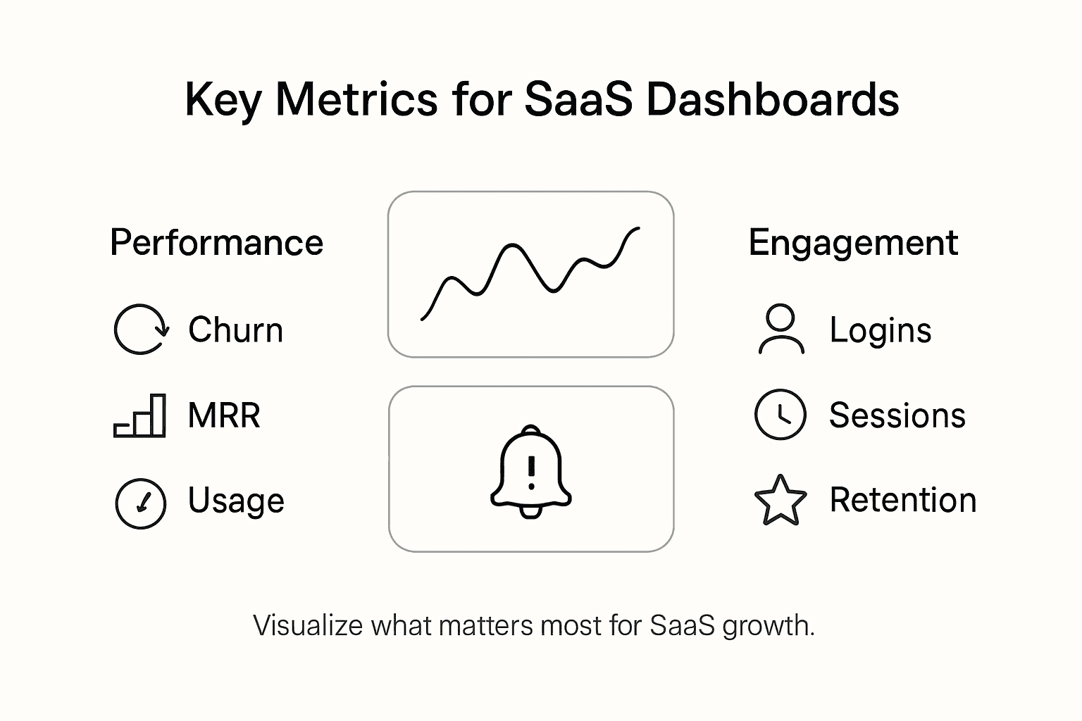
Actionable learning analytics focus on providing real-time, practical insights that stakeholders can use to make informed decisions and improve outcomes. Begin by identifying the key performance indicators most critical to your organization. These metrics should directly connect to your strategic goals and enable quick, informed decision making. Implementing actionable metrics requires defining clear, specific, and measurable outcomes that guide dashboard design with precise, action-oriented language.
When designing your visualizations, prioritize clarity and immediate comprehension. Use color coding to highlight performance trends, create comparative charts that show progress over time, and implement interactive elements that allow users to drill down into specific data points. Select visualization types that match your data best bar charts for comparing categories, line graphs for tracking trends, and pie charts for showing composition. Ensure each visualization includes context like baseline comparisons, target markers, and clear labels that explain what the data represents.
Pro Tip: Schedule quarterly metric review sessions to reassess your dashboard metrics and ensure they remain aligned with evolving business objectives and strategic priorities.
Step 5: Test dashboard performance and usability
Testing your analytics dashboard is the critical final step that ensures your carefully designed tool actually delivers value to your team. Your objective is to validate the dashboard’s functionality, performance, and user experience through systematic and comprehensive evaluation.
Begin with technical performance testing, which involves assessing the dashboard’s loading speed, data refresh rates, and responsiveness across different devices and network conditions. Use tools that simulate various user scenarios and measure key metrics like response time, resource consumption, and stability under different workloads. Pay special attention to how the dashboard performs with large datasets and during concurrent user access.
Conducting usability testing requires gathering feedback from actual team members who will use the dashboard daily. Create a structured testing protocol that includes specific tasks for users to complete, such as filtering data, generating reports, and extracting insights. Observe how intuitively team members navigate the interface, track the time required to accomplish specific goals, and collect qualitative feedback about their experience. Look for points of friction, unexpected behavior, or areas where the user interface could be more transparent or streamlined.
Below is a comparison of testing approaches for dashboard performance and usability:
| Testing Approach | Main Focus | Common Tools |
|---|---|---|
| Technical Performance | Speed, stability, data freshness | JMeter, Lighthouse |
| Usability Testing | User experience, task completion | UserTesting.com, Lookback |
| Load Testing | Concurrent access behavior | BlazeMeter, Locust |
Pro Tip: Implement a continuous feedback loop by embedding a short survey mechanism directly into the dashboard, allowing users to report issues and suggest improvements in real time.
Step 6: Launch dashboard and verify team adoption
Launching your analytics dashboard marks the culmination of your hard work and the beginning of transforming your team’s data driven decision making process. Your goal is not just to release the dashboard but to ensure it becomes an integral part of your organization’s daily workflow.
Verifying team adoption involves monitoring how consistently users access and utilize the dashboard to support decision making and performance tracking. Start by organizing a comprehensive onboarding session that demonstrates the dashboard’s value and functionality. Break down the training into practical segments that show team members how specific dashboard features solve their immediate work challenges. Successful adoption requires understanding the factors driving willingness to use the dashboard, including relevance to user needs and ease of integration into existing practices.
Implement a structured approach to tracking adoption metrics. Monitor key indicators such as login frequency, time spent on the dashboard, number of interactive feature uses, and the extent to which insights are translated into actual business actions. Create a feedback mechanism that allows team members to share their experiences, suggest improvements, and report any usability issues. Consider implementing a phased rollout strategy where you gradually introduce the dashboard to different team segments, allowing you to gather targeted feedback and make incremental improvements.
Pro Tip: Assign dashboard champions across different departments who can enthusiastically promote the tool, provide peer support, and help drive organic adoption within their teams.
Frequently Asked Questions
How do I define the objectives for my SaaS analytics dashboard?
To define dashboard objectives, engage with stakeholders to identify key performance metrics that matter most to your organization. Schedule a meeting with team leaders to outline these objectives, ensuring your dashboard focuses on what drives decision making.
What data sources should I consider integrating into my analytics dashboard?
Include a variety of data sources such as CRM systems, web analytics, and customer support platforms. Evaluate your existing data ecosystem and aim for comprehensive coverage that enhances the insights delivered by your dashboard.
How can I design a user-friendly interface for my analytics dashboard?
Focus on user-centered design principles by creating a clear and logical layout. Utilize grid-based organization, consistent color schemes, and interactive elements that allow users to quickly navigate and understand the data presented.
What steps should I take to build a robust data pipeline for my dashboard?
Begin by identifying all data sources and their collection methods, then implement an Extract, Transform, Load (ETL) process for cleaning and validating data. Document each data source and transformation rule to maintain consistency and clarity within your team.
How can I ensure my dashboard metrics are actionable?
Identify key performance indicators directly aligned with your organization’s strategic goals. When creating visualizations, use clear context such as baseline comparisons and interactive elements that help stakeholders derive meaningful insights.
What should I do to verify team adoption of the newly launched dashboard?
Track user engagement metrics such as login frequency and time spent on the dashboard. Facilitate onboarding sessions and create feedback mechanisms to promote its continued use, ensuring it integrates smoothly into your team’s workflow.

About the Author
Josh AndersonCo-Founder & CEO at Rule27 Design
Operations leader and full-stack developer with 15 years of experience disrupting traditional business models. I don't just strategize, I build. From architecting operational transformations to coding the platforms that enable them, I deliver end-to-end solutions that drive real impact. My rare combination of technical expertise and strategic vision allows me to identify inefficiencies, design streamlined processes, and personally develop the technology that brings innovation to life.
View Profile

