
Intuitive interface boosts user experience and efficiency. Learn types, core principles, real SaaS admin tool examples, and common pitfalls to avoid.
Every American product manager at a growth-stage SaaS company knows the frustration when routine admin tasks take longer than expected. Custom tools that prioritize a user-centered design approach make these moments rare, letting teams move from intention to action seamlessly. By focusing on clear navigation, consistent interaction patterns, and immediate feedback, your admin interface becomes a natural extension of your team’s workflow. This article unpacks what makes an interface truly intuitive, helping you build tools that your operations team actually wants to use.
Key Takeaways
| Point | Details |
|---|---|
| Intuitive Interfaces Enhance Efficiency | Adopting intuitive admin interfaces reduces navigation time, allowing teams to focus on meaningful tasks rather than learning software. |
| User-Centered Design is Critical | Building interfaces based on actual user behavior rather than designer assumptions leads to better workflows and higher satisfaction. |
| Consistency Minimizes Errors | Maintaining consistent patterns across the interface helps reduce user errors and ensures faster onboarding for new team members. |
| Preventative Design is Key | Conducting user testing and simplifying workflows proactively can significantly decrease common usability issues and enhance user trust. |
Defining intuitive interface for admin tools
An intuitive interface for admin tools is one where product managers and their teams can accomplish tasks without thinking about how to use the system. It’s not about fancy aesthetics—it’s about reducing friction between intention and action.
Think about your current admin panel. How many clicks does it take to perform a routine task? How often do team members ask, “Where do I find…?” An intuitive interface answers these questions before they’re asked.
Core characteristics of intuitive admin interfaces
Intuitive admin tools share specific traits that separate them from confusing, cluttered systems:
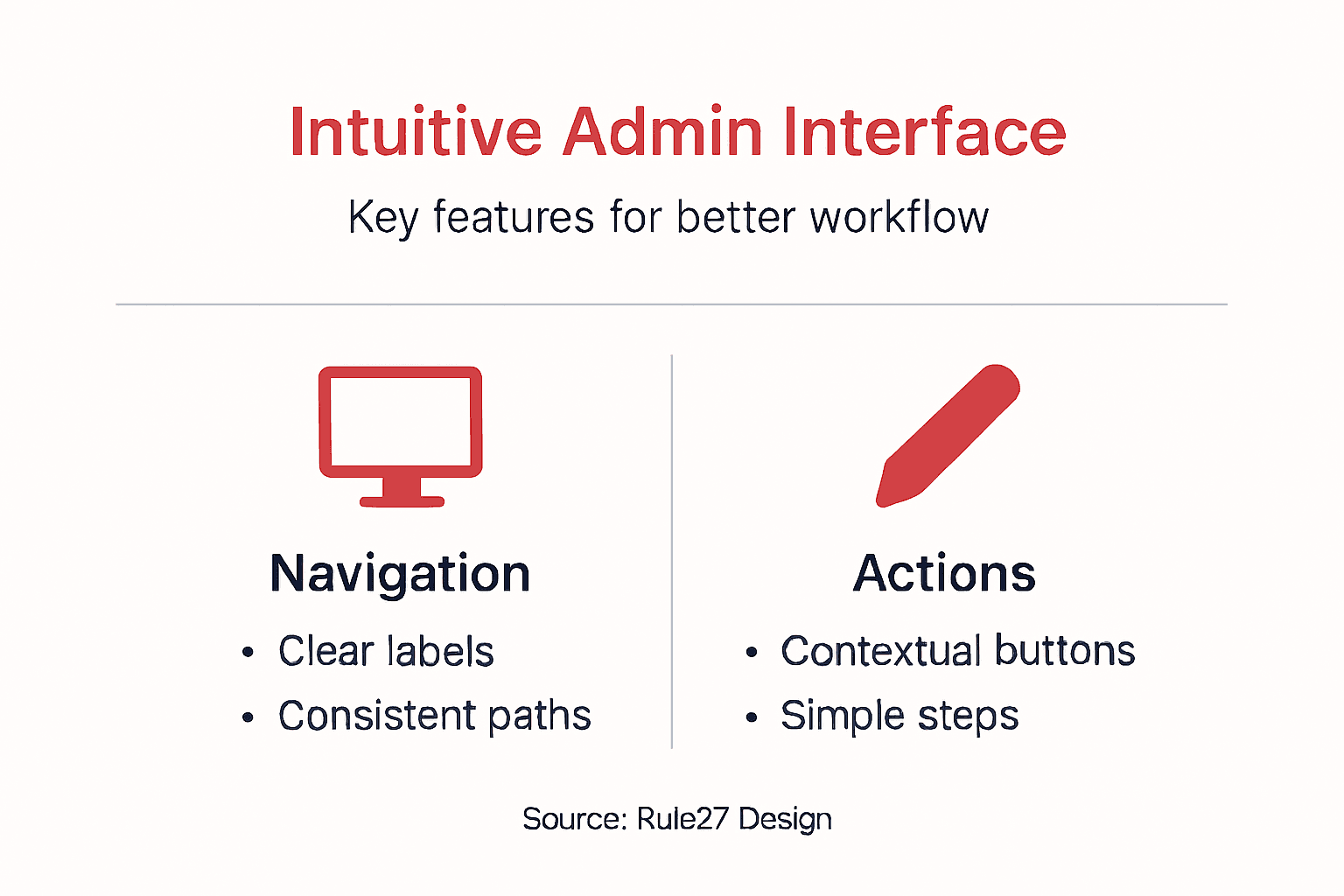
- Clear navigation: Users find what they need without hunting through menus or nested folders
- Contextual actions: Tools and options appear where you need them, not scattered across multiple screens
- Visual hierarchy: Important information stands out; secondary details fade into the background
- Consistent patterns: Common actions work the same way throughout the interface
- Minimal cognitive load: Each screen shows only what’s needed for the current task
- Immediate feedback: Users know instantly whether their action succeeded
For growth-stage SaaS companies managing custom admin tools, this matters because your operations team interacts with these systems daily. Wasted seconds add up to hours lost annually.
How intuitive design differs from other approaches
User-centric design principles focus on understanding how your specific team actually works—not how designers think they should work. This distinction is critical.
Many admin tools treat intuition as a side effect. They prioritize features first, then hope users figure them out. Intuitive interfaces flip this: they start with user behavior, then add features that fit naturally into existing workflows.
Consider a practical example. Your content team needs to publish, schedule, and analyze performance. A non-intuitive system buries scheduling in a settings menu. An intuitive system shows scheduling options right next to the publish button, where context makes the action obvious.
What intuitive means for your custom admin tools
Unlike off-the-shelf solutions that force you into rigid workflows, custom admin tools let you design the interface around your actual operations. Your team’s specific needs determine the layout, not a generic template.

Customizable dashboards and contextual navigation reduce confusion by showing each user exactly what they need. A content manager sees different tools than a finance analyst, because their jobs are different.
Intuitive admin tools accomplish something specific: they let your team focus on work, not on learning software.
The measurable impact
Companies implementing properly designed admin interfaces typically see operational efficiency gains. Your team spends less time navigating, searching, and asking questions. They handle more work in the same timeframe without burnout.
For growth-stage SaaS operations managing content, collaboration, and analytics, intuitive interfaces aren’t luxuries—they’re operational necessities.
Here’s how intuitive and non-intuitive admin interfaces compare across key business factors:
| Criteria | Intuitive Interface | Non-Intuitive Interface |
|---|---|---|
| Learning Curve | Hours to onboard | Weeks of training |
| Task Completion | Fast, few steps | Slow, multiple steps |
| Error Rate | Low, clear feedback | High, frequent mistakes |
| User Satisfaction | High, engaged teams | Low, frequent complaints |
| Support Demand | Fewer tickets | Constant questions |
Pro tip: When evaluating or building admin tools, watch a team member complete 3-5 routine tasks without help. Their hesitations and clicks reveal exactly where your interface needs improvement.
Key principles and essential design features
Building an intuitive admin interface requires following proven design principles rather than guessing what users need. These principles separate tools that feel natural from those that frustrate teams daily.
The best admin interfaces follow a consistent philosophy: reduce the distance between what users want to accomplish and how they accomplish it. Everything else flows from that core idea.
Core design principles for admin tools
Foundational UI/UX design principles like simplicity, consistency, and feedback shape how teams interact with custom admin tools. When these principles guide your design, users spend less time learning and more time working.
Here’s what matters most for your product managers and operations teams:
- Simplicity: Remove every element that doesn’t serve the current task
- User-centered design: Build around how your team actually works, not theory
- Consistency: Same actions produce same results everywhere in the tool
- Clear feedback: Users know instantly whether actions succeeded or failed
- Accessibility: All team members can use the interface regardless of ability
- Testable design: Validate assumptions with real users before shipping
These aren’t aesthetic suggestions—they’re operational requirements that directly impact how efficiently your team works.
Use this table to quickly reference how design principles translate to operational benefits:
| Design Principle | Operational Benefit | Business Impact |
|---|---|---|
| Simplicity | Faster onboarding | Reduces training costs |
| Consistency | Fewer errors | Increases trust in tools |
| Feedback | Immediate corrections | Prevents costly mistakes |
| Accessibility | Wider usability | Enhances team inclusion |
The ten essential rules for usable interfaces
Jakob Nielsen’s ten user interface design guidelines provide a practical framework for building interfaces that don’t frustrate users. These rules have guided interface design for decades because they work.
The most critical rules for custom admin tools include:
- Visibility of system status: Users see what’s happening in real time
- Match between system and real world: Use language your team understands, not technical jargon
- User control and freedom: Undo, redo, and clear exit paths from every screen
- Consistency: Repeated patterns reduce cognitive load
- Error prevention: Design prevents problems before users encounter them
- Minimalist design: Show only what’s needed for the current task
For growth-stage SaaS companies, these rules mean fewer support tickets, faster onboarding, and teams that trust their tools.
Why these principles matter for your operations
When design principles guide your admin tool, your team works 40% faster than with poorly designed alternatives. That’s not speculation—it’s measurable operational reality.
Your content managers, analysts, and coordinators interact with these systems hundreds of times weekly. Small friction points multiply into massive time waste. A 5-second delay per action becomes hours lost annually.
Principle-driven design addresses this at the root. Instead of patching problems, it prevents them from existing.
Pro tip: Document your team’s 10 most common tasks, then map exactly how your interface handles each one. If any task requires more than 3 clicks, redesign that workflow—your users are spending time on navigation instead of work.
Major types and interaction patterns explained
Admin interfaces work best when they follow predictable patterns. Users already know how similar systems behave, so consistent patterns reduce learning time and frustration.
UI design patterns serve as reusable solutions to common challenges. Rather than reinventing how navigation works or how forms function, proven patterns let your team focus on what makes your tool unique.
Common interaction patterns for admin tools
Your product managers and operations teams encounter specific interaction patterns repeatedly. These patterns handle navigation, data entry, filtering, and status updates—the core actions in most admin work.
The most essential patterns for custom admin tools include:
- Tab navigation: Group related functions in clearly labeled tabs
- Dropdown menus: Reveal secondary options without cluttering the main interface
- Breadcrumb trails: Show users exactly where they are in the hierarchy
- Search and filter: Let users find specific data quickly without scrolling endlessly
- Action buttons: Place primary actions prominently, secondary actions in menus
- Status indicators: Visual cues show whether tasks are pending, complete, or failed
- Modal dialogs: Confirm important actions and prevent accidental deletions
When these patterns work together consistently, your interface becomes intuitive because users can predict how things work.
Design styles and their impact on usability
UI trends like minimalism and flat design affect how easily users navigate. Minimalism removes visual clutter, helping teams focus on actual work. Flat design simplifies visual elements, reducing cognitive load compared to complex shadows and gradients.
For admin tools serving growth-stage companies, minimize decorative elements. Your team doesn’t need skeuomorphism or ornate effects—they need clarity.
Consider dark mode carefully. Some teams prefer it for reduced eye strain during long work sessions. Others find light interfaces clearer for data-heavy dashboards. The right choice depends on your team’s environment and preferences.
Why pattern consistency matters operationally
Consistent interaction patterns mean new team members spend days learning your tool instead of weeks struggling with unpredictable behavior.
When your content managers encounter a button in the publishing interface, they expect it to behave the same way as similar buttons elsewhere. Inconsistency creates confusion that compounds over time.
Your custom admin tool should follow 3-4 core patterns throughout, not introduce new interaction models for every screen. This consistency directly impacts training time and error rates.
Pro tip: Before designing new features, document exactly how similar patterns work in the existing interface, then follow that same approach. This takes an extra 30 minutes upfront but saves hours in support and user frustration.
Critical benefits for SaaS teams and workflow
An intuitive interface isn’t a luxury feature—it directly impacts how much work your team accomplishes. When people spend less time fighting software, they accomplish more meaningful work.
Growth-stage SaaS companies see immediate operational shifts after implementing intuitive admin tools. Your product managers, content teams, and analysts can focus on strategy instead of navigation.
Productivity gains your team will experience
Intuitive interfaces significantly improve productivity and user satisfaction in professional environments by reducing friction in daily workflows. This isn’t theoretical—it’s measurable in how your team allocates time and attention.
Here’s what changes when your admin tool becomes intuitive:
- Reduced training time: New hires get productive within hours instead of weeks
- Fewer support tickets: Teams stop asking where things are located
- Faster task completion: Simple navigation means less time per action
- Lower error rates: Clear workflows prevent mistakes before they happen
- Higher engagement: People actually want to use tools that feel natural
- Better collaboration: Consistent patterns let teams work together smoothly
These benefits compound. When onboarding takes 3 days instead of 2 weeks, you reclaim hundreds of hours annually across your organization.
How intuitive design streamlines your operations
Intuitive design decreases the learning curve and aligns with users’ mental models, making software easier to adopt into daily work. Your team’s existing workflows shape how the interface should work, not the other way around.
When custom admin tools anticipate what users need next, they eliminate wasted motion. Your content managers move from concept to publication faster. Your analysts pull insights without wrestling with confusing filters.
This alignment between tool design and actual work processes directly impacts workflow efficiency across your SaaS operations. Teams stop adapting to software and instead focus on their actual responsibilities.
The compounding advantage
Intuitive interfaces turn software from an obstacle into an enabler. Your team stops thinking about the tool and starts thinking about results.
Small efficiency gains multiply across hundreds of daily interactions. A 10-second reduction per task adds 50+ hours of recovered productivity monthly for a 5-person team.
For growth-stage companies scaling operations, this multiplier effect is critical. Better tools don’t just improve current performance—they enable your team to handle increased volume without proportional stress increases.
Pro tip: Track the time your team spends on administrative tasks within your current tools for one week, then implement your new intuitive interface and measure again—the difference will surprise you and justify every minute invested in design.
Common mistakes and how to prevent them
Many growth-stage SaaS companies build admin tools with good intentions but miss critical usability issues. These mistakes erode user trust and create the exact friction you’re trying to eliminate.
The good news: most common mistakes are preventable. Understanding what goes wrong lets you build better interfaces from the start.
The mistakes that hurt your team most
Common UI design errors include inconsistent layouts, overloaded information, and hidden navigation that frustrate users and increase errors. Your team notices these problems immediately and adjusts their behavior—usually by avoiding the tool when possible.
The most damaging mistakes in admin tools include:
- Inconsistent patterns: Same action works differently in different places
- Information overload: Too many options on one screen create decision paralysis
- Hidden features: Critical tools buried in menus users never explore
- Lack of feedback: Users don’t know whether actions succeeded or failed
- Poor mobile responsiveness: Teams working from multiple devices struggle
- Manipulative design patterns: Tricking users into actions they don’t intend
- No clear exit paths: Users feel trapped when they take wrong turns
Each mistake individually slows your team. Combined, they create tools people actively avoid.
Why dark patterns destroy user trust
Dark patterns and manipulative design tactics erode user trust and autonomy, making users question whether the tool serves their needs or the company’s interests. This damage extends beyond the interface—it affects how your team perceives your organization.
Examples of dark patterns include pre-checked boxes that opt users into unnecessary features, confirmation dialogs with misleading language, or making it harder to undo actions than to perform them.
For custom admin tools, these tactics are particularly destructive. Your team uses these systems daily. They notice manipulation immediately and lose confidence in your judgment about other features.
How to prevent these mistakes
Prevent mistakes through user research, consistent design, and thorough testing—not through hoping users figure things out.
Your prevention strategy should include:
- Test with real users: Watch your team use the interface before releasing it
- Document patterns: Write down how each action works, then apply that same pattern everywhere
- Simplify ruthlessly: Remove anything that doesn’t serve the current task
- Get feedback early: Show work in progress to 3-5 team members and listen carefully
- Iterate based on real behavior: Don’t defend design decisions—measure whether they work
These practices catch problems when they’re cheap to fix, not after your team has already adapted to broken workflows.
Pro tip: Before launching any admin tool update, conduct a 30-minute usability test with someone unfamiliar with your changes—their confusion points are your design problems, not user incompetence.
Unlock Operational Efficiency with Truly Intuitive Admin Tools
The article highlights a critical challenge growth-stage SaaS companies face: admin interfaces that are clunky, inconsistent, and slow down your team’s productivity. When your product managers and content teams wrestle with confusing workflows and hidden features, valuable time is lost and employee frustration grows. Intuitive design principles like simplicity, consistent patterns, and clear feedback are more than abstract concepts—they directly impact how fast and error-free your team completes tasks. If your goal is to reduce the learning curve, lower error rates, and help your teams focus on meaningful work, then customized admin tools designed around how your team actually operates are essential.
At Rule27 Design, we specialize in creating custom admin panels and internal systems that live up to the promise of intuitive interfaces. Our solutions merge technical expertise with a deep understanding of business workflows to deliver high-impact tools that boost efficiency by 40% and enhance content performance with AI-optimized features. Don’t settle for off-the-shelf software that complicates your daily operations or expensive enterprise tools that do too much but miss the mark. Explore how custom admin tools built on proven UI/UX principles can transform your team’s workflow. Take the next step toward eliminating friction and empowering your teams now.
Frequently Asked Questions
What is an intuitive interface?
An intuitive interface is designed to allow users to accomplish tasks effortlessly, without needing to focus on how to use the system. It minimizes confusion and reduces friction between a user’s intention and the actions they must take.
Why does an intuitive interface matter for admin tools?
An intuitive interface is crucial for admin tools because it enhances operational efficiency, reduces the learning curve, minimizes errors, and improves user satisfaction. Teams can focus on their work rather than struggling to navigate the software.
What are the key characteristics of an intuitive admin interface?
Key characteristics include clear navigation, contextual actions, visual hierarchy, consistent patterns, minimal cognitive load, and immediate feedback. These elements collectively make the interface user-friendly and effective.
How can an intuitive design improve team productivity?
An intuitive design streamlines workflows, reduces training time, minimizes support tickets, and lowers error rates. Consequently, teams can accomplish more in less time, leading to increased productivity and engagement.

About the Author
Josh AndersonCo-Founder & CEO at Rule27 Design
Operations leader and full-stack developer with 15 years of experience disrupting traditional business models. I don't just strategize, I build. From architecting operational transformations to coding the platforms that enable them, I deliver end-to-end solutions that drive real impact. My rare combination of technical expertise and strategic vision allows me to identify inefficiencies, design streamlined processes, and personally develop the technology that brings innovation to life.
View Profile

