
Data visualization in healthcare streamlines analysis, enhances patient care, ensures regulatory compliance, and helps avoid costly mistakes. Learn key techniques and applications.
Staring at endless spreadsheets rarely gives American healthcare teams the clarity they need. Every day, complex patient data flows in, yet operational decisions often rely on quick, easy-to-understand visuals. For data analysts and administrators at mid-sized healthcare tech companies, mastering data visualization means turning raw numbers into immediate, actionable insights. This guide highlights proven approaches for transforming healthcare data, offering practical ways to boost both patient outcomes and operational efficiency.
Key Takeaways
| Point | Details |
|---|---|
| Importance of Data Visualization | Transforming health metrics into clear visuals enhances decision-making and improves operational efficiency across healthcare teams. |
| Tailored Dashboard Design | Custom dashboards should reflect specific stakeholder needs to ensure clarity and enable immediate insights for decision-making. |
| Security and Compliance | Protecting patient data is crucial; visualization tools must adhere to HIPAA and other regulatory standards to mitigate risks. |
| User-Centric Approach | Understanding the diverse priorities of stakeholders is essential to designing effective visualizations that drive user engagement and adoption. |
Defining Data Visualization in Healthcare
Data visualization in healthcare transforms raw numbers into actionable insights your team can actually use. It’s the difference between staring at a spreadsheet of admission rates and instantly seeing a trend across multiple facilities.
At its core, data visualization converts complex health metrics into charts, graphs, dashboards, and interactive displays. Your administrators see patterns. Your clinicians spot anomalies. Your analysts prove impact. Everyone wins.
Why does this matter for your organization? Healthcare generates enormous amounts of data daily. Patient outcomes, operational metrics, financial performance, staffing levels—the list never stops. Without visualization, this data stays locked away. Visual communication in public health plays a crucial role in making health data accessible to diverse audiences, including policymakers and healthcare professionals.

What Makes Healthcare Visualization Different
Healthcare visualization isn’t just making data look pretty. It solves specific operational challenges your team faces:
- Clarity under pressure: During emergencies, teams need answers in seconds, not hours.
- Multi-audience communication: The same data must work for clinicians, administrators, and board members.
- Regulatory compliance: Your visualizations must accurately represent data without distortion.
- Real-time decision making: Static reports from yesterday won’t cut it when patient safety is on the line.
Healthcare data visualization bridges the gap between raw information and actionable decisions that directly impact patient outcomes and operational efficiency.
Think of visualization as translation. Your EHR system speaks in databases and tables. Your staff speaks in trends, patterns, and relationships. Visualization becomes the interpreter.
For mid-sized healthcare tech companies, this is where custom administrative systems shine. You need dashboards that match your exact workflow. Off-the-shelf solutions often miss the nuances of your specific operations. A tailored dashboard that shows exactly what your team needs—patient admission trends, department-level performance, resource utilization—removes friction from decision-making.
The goal isn’t complexity. It’s clarity. The best healthcare data visualization answers a specific question quickly and accurately.
Pro tip: Start by mapping which metrics matter most to your stakeholders—administrators care about efficiency and compliance, clinicians care about patient safety, leadership cares about financial impact. Build visualizations around these priorities, not generic dashboards.
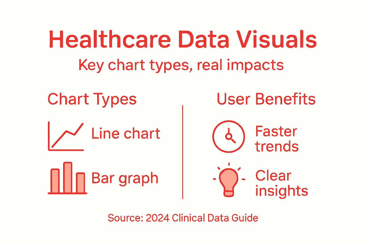
Key Visualization Types and Use Cases
Not all data tells the same story. Different metrics demand different visual approaches. Your job is matching the right chart type to the right question.
Healthcare teams need multiple visualization formats because patient data, operational metrics, and financial performance each reveal insights differently. Data visualization types include charts, graphs, maps, dashboards, and specialized formats used to communicate different public health data effectively across contexts.
Common Visualization Types in Healthcare
Your toolkit should include these formats:
Here’s a quick overview of common visualization tools and their typical applications in healthcare:
| Visualization Tool | Best Use Case | User Impact |
|---|---|---|
| Line chart | Tracking patient trends | Reveals changes over time |
| Bar chart | Comparing departments | Highlights differences easily |
| Heat map | Spatial data analysis | Locates high-risk zones |
| Dashboard | Consolidated monitoring | Simplifies decision-making |
| Geographic map | Mapping outbreaks | Guides public health responses |
- Line charts: Track admission rates, patient recovery metrics, or infection rates over time. Perfect for spotting trends.
- Bar charts: Compare department performance, staffing levels, or resource utilization across multiple units.
- Heat maps: Show patient flow patterns, bed occupancy by time of day, or readmission risk across geographic areas.
- Dashboards: Combine multiple visualizations into one view. Your administrators see everything they need in one screen.
- Geographic maps: Display patient demographics, facility locations, or disease outbreak patterns across regions.
Matching Visualizations to Your Goals
Healthcare data analytics incorporates various visual representations to uncover patterns and inform treatment decisions. Medical data analytics for patient-level insights, clinical analytics for care processes, and hospital data analytics for operational metrics each require different visualization approaches.
Here’s how to choose:
- Patient outcomes: Use line charts and heat maps to track recovery rates and treatment effectiveness.
- Operational efficiency: Use bar charts and dashboards to monitor staffing, bed availability, and appointment scheduling.
- Financial performance: Use bar charts and trend analysis to show revenue by department or cost containment progress.
- Quality metrics: Use dashboards combining multiple data points—readmission rates, infection rates, wait times.
The right visualization answers your question immediately. If your team needs to study the chart, you picked the wrong format.
Your mid-sized healthcare tech company needs flexible systems that adapt. One hospital’s critical metric is another’s footnote. Custom administrative dashboards let you build exactly what your clients need without forcing them into generic templates.
Start simple. A line chart showing daily admission trends beats a complex multi-layered visualization nobody understands. Your team should grasp the insight in seconds, not minutes.
Pro tip: Build your first dashboard around one critical decision your team makes daily. If administrators check bed occupancy first thing every morning, make that the centerpiece. Add other metrics around it, not the reverse.
Integrating Tools and Technologies Securely
Your visualization tool is only as good as its security architecture. A beautiful dashboard means nothing if patient data leaks during transmission or storage.
Healthcare data demands special handling. Patient information falls under HIPAA regulations. Your visualization infrastructure must protect it at every stage—collection, processing, storage, and display. This isn’t optional. It’s foundational.
Building Secure Data Pipelines
Effective healthcare data analysis requires collaboration among stakeholders to understand end-user needs and securely integrate visualization tools. Building expertise in data visualization is a progressing skill necessary to curate and present meaningful healthcare data insights within compliant frameworks.
Your integration strategy should address:
To help you plan secure integration, compare key security features for healthcare data visualization tools:
| Security Feature | Why It Matters | Typical Benefit |
|---|---|---|
| Data encryption | Prevents breaches | Protects patient privacy |
| Access controls | Restricts data sharing | Limits unauthorized use |
| Audit logging | Tracks interactions | Aids compliance review |
| API security | Secures connections | Blocks external threats |
- Data encryption: Encrypt patient information both in transit and at rest using industry-standard protocols.
- Access controls: Restrict who sees which dashboards and metrics based on role and department.
- Audit trails: Log every data access and visualization interaction for compliance verification.
- API security: Use secure authentication methods when connecting visualization tools to your EHR system.
- Data validation: Verify data integrity before it reaches your dashboards.
Technology Standards Matter
Healthcare data analytics education emphasizes interoperability standards to securely collect, process, and visualize healthcare data. Training includes best practices for ensuring data security while enabling effective analytics to support clinical workflows.
Mid-sized healthcare tech companies often struggle here. You’re integrating multiple systems—EHR platforms, billing software, patient management tools. Each connection creates a potential vulnerability. Custom administrative systems let you control data flow precisely.
Security isn’t a feature you add later. It’s the foundation everything else sits on.
When evaluating tools, ask vendor-specific questions. How is data encrypted? What compliance certifications do they hold? Can they provide audit logs on demand? Do they follow FHIR standards for interoperability?
Your team needs training too. A secure system fails when users share passwords or download unencrypted data to personal devices. Security is cultural.
Pro tip: Start with a security audit of your current data flows before adding new visualization tools. Map where patient data moves, identify weak points, then choose tools that strengthen those specific areas rather than adding complexity.
Compliance, Risks, and Common Pitfalls
Data visualization in healthcare operates under intense regulatory scrutiny. One mistake doesn’t just hurt your dashboard—it exposes patient data and triggers legal consequences.
Compliance isn’t something you check off once. It’s an ongoing process that touches every aspect of your visualization system. Your team needs to understand what can go wrong and how to prevent it.
Understanding Your Regulatory Landscape
Healthcare data privacy in the United States is governed by a complex patchwork of federal and state laws. The increasing use of digital health technologies raises concerns over data breaches and unauthorized use of health information, highlighting the importance of robust privacy protections.
You’re dealing with multiple regulatory frameworks simultaneously:
- HIPAA: Protects patient medical information and privacy rights.
- State privacy laws: California, New York, and others impose additional requirements beyond federal rules.
- HITECH Act: Extends HIPAA liability and increases breach notification requirements.
- FDA regulations: If your visualization tool processes medical device data, FDA oversight applies.
Common Pitfalls Your Team Should Avoid
Healthcare data governance focuses on ensuring data quality, integrity, security, and accessibility throughout its lifecycle. Programs should manage structured and unstructured data with clearly defined procedures to mitigate risks such as unauthorized access, data breaches, and inaccuracies.
Here’s where teams typically stumble:
- Inadequate access controls: Sharing dashboards too broadly instead of role-based permissions.
- Unencrypted data exports: Allowing users to download raw data without encryption protections.
- Poor audit logging: Not tracking who accessed what data and when.
- De-identification failures: Assuming removing names protects privacy when other identifiers remain.
- Vendor oversight gaps: Not verifying third-party tool security before integration.
Compliance failures happen through small oversights, not dramatic breaches. Lock down the basics first.
Mid-sized healthcare tech companies often lack dedicated compliance teams. Your development and operations staff shoulder this burden. Build compliance into your system architecture from day one rather than retrofitting it.
Think about your worst-case scenario. What happens if someone gains unauthorized access to your visualization platform? Can they see all patient data across all facilities? That’s a problem. Your system should compartmentalize access so one breach doesn’t expose everything.
Pro tip: Schedule a quarterly compliance review with your legal and security teams specifically focused on your visualization tools. Ask what changed in regulations, what vulnerabilities exist, and what your team might be missing. Small meetings prevent expensive surprises.
Maximizing Impact and Avoiding Mistakes
A well-designed dashboard sits unused. A poorly designed one gets used wrong. The difference between success and failure is understanding your audience and what they actually need to do.
Data visualization fails silently. Nobody complains about a confusing chart. They just ignore it and make decisions without the data you worked hard to compile.
Understanding Your Audience First
Maximizing data visualization impact in healthcare requires understanding audience needs and providing clear, reliable visual narratives. Visualizations reduce cognitive load and support better decision-making but must be tailored for the specific user and task to avoid misunderstanding and misuse.
Your stakeholders have different priorities. Think about them separately:
- Administrators: Need operational metrics and cost data to manage budgets and staffing.
- Clinicians: Need patient-specific information and outcome trends to guide treatment decisions.
- Leadership: Need high-level performance summaries and strategic metrics for board reporting.
- Quality teams: Need detailed breakdowns of compliance metrics and performance gaps.
Building one dashboard for everyone guarantees it works for nobody. Your custom administrative system should let teams create role-specific views from shared data.
Common Mistakes That Kill Adoption
Optimizing healthcare data visualization improves cognitive workflows and patient outcomes by making data more intuitive and actionable. Best practices include user-centered design, real-time data display, and iterative evaluation to ensure clarity and relevance.
Avoid these pitfalls:
- Information overload: Cramming too many metrics onto one screen overwhelms users.
- Outdated data: Dashboards showing yesterday’s information lose credibility fast.
- Unclear labels: Technical jargon confuses clinicians who need quick answers.
- Poor color choices: Red-green combinations fail for color-blind users and distract from data.
- No interactivity: Static charts don’t answer follow-up questions your team actually asks.
The best visualization is the one your team actually uses. Complexity kills adoption.
Start with one critical decision. What does your team need to know first thing every morning? Build around that. Add everything else later.
Test with real users before rollout. Show a prototype to five clinicians or administrators. Watch them navigate it without instructions. Where do they struggle? That’s where your design fails.
Pro tip: Run monthly feedback sessions with dashboard users and track which visualizations get clicked versus ignored. Replace unused charts with metrics your team actually requested. Your dashboard should evolve as needs change.
Transform Healthcare Data Into Clear, Actionable Insights Today
Healthcare organizations face the challenge of turning overwhelming data into meaningful visual stories that improve patient outcomes and streamline operations. If you are searching for a way to create custom dashboards tailored to your unique workflows and avoid the pitfalls of generic, one-size-fits-all solutions, Rule27 Design can help. We specialize in building secure, scalable administrative systems that bridge technical architecture with your business goals.
Take control over your healthcare data visualization by partnering with a team experienced in delivering intuitive interfaces and robust backend solutions. Visit Rule27 Design now to see how our custom admin panels and digital infrastructure can empower your staff to make faster, smarter decisions. Don’t let outdated or confusing data hold your organization back. Explore our services at Rule27 Design and start crafting visual tools that your clinicians and administrators will actually use.
Frequently Asked Questions
What is data visualization in healthcare?
Data visualization in healthcare refers to the process of transforming raw health data into visual formats such as charts, graphs, and dashboards, making it easier for healthcare teams to interpret and act on that information.
How does data visualization improve patient outcomes?
Data visualization helps identify trends, spot anomalies, and facilitate real-time decision-making, which can enhance patient care and operational efficiency, ultimately leading to improved patient outcomes.
What are the key types of data visualizations used in healthcare?
Common types of data visualizations in healthcare include line charts for tracking trends, bar charts for comparing departments, heat maps for spatial analysis, dashboards for consolidated monitoring, and geographic maps for mapping outbreaks.
How can I ensure the security of healthcare data visualizations?
To ensure the security of healthcare data visualizations, implement features like data encryption, access controls, audit logging, API security, and data validation, and routinely conduct security audits to safeguard patient information.

About the Author
Josh AndersonCo-Founder & CEO at Rule27 Design
Operations leader and full-stack developer with 15 years of experience disrupting traditional business models. I don't just strategize, I build. From architecting operational transformations to coding the platforms that enable them, I deliver end-to-end solutions that drive real impact. My rare combination of technical expertise and strategic vision allows me to identify inefficiencies, design streamlined processes, and personally develop the technology that brings innovation to life.
View Profile

