
Explore this custom reporting dashboard guide for growth-stage SaaS teams. Discover a step-by-step approach to optimize reporting and boost operational efficiency.
More than half of American SaaS product managers struggle to turn scattered data into clear, actionable reports. For growth-stage companies, reporting inefficiencies waste time and lead to confusion about what truly drives progress. Custom dashboards give teams instant access to the right numbers when they need them most, making it easier to align strategies and catch opportunities before they slip away.
Step 1: Define key metrics and reporting needs
Successful SaaS teams start by mapping out exactly what matters most for their business performance. Understanding which metrics truly drive your growth helps create a reporting dashboard that transforms raw data into actionable insights.
Begin by identifying your core business objectives. SaaS reporting tracks vital metrics like user engagement, customer acquisition cost, and churn rate, enabling teams to make strategic decisions. Break down your objectives by different team responsibilities: sales might focus on monthly recurring revenue (MRR), while customer success tracks retention rates. Consider creating specific metric categories such as:
- Acquisition metrics: Cost per lead, conversion rates, marketing channel performance
- Revenue metrics: MRR, annual recurring revenue (ARR), customer lifetime value
- Operational metrics: Customer support response times, product usage intensity
Select metrics that directly connect to your strategic goals. Focused reporting helps in continuous monitoring and better strategic planning, so prioritize indicators that provide clear performance snapshots. Not every potential metric deserves dashboard real estate just because it exists.
Here’s a quick comparison of key SaaS dashboard metric categories and their main focuses:
| Metric Category | Primary Focus | Example KPIs |
|---|---|---|
| Acquisition Metrics | Grow customer base | Cost per lead, conversion |
| Revenue Metrics | Maximize recurring income | MRR, ARR, lifetime value |
| Operational Metrics | Enhance product/service quality | Support times, usage rates |
Pro tip: Schedule quarterly metric reviews to ensure your reporting dashboard evolves alongside your business strategy and growth objectives.
Step 2: Select tech stack and integration strategy
Building a custom reporting dashboard requires strategic technology choices that align with your team’s unique operational needs. Your tech stack will determine how smoothly data flows and how effectively you can transform raw information into meaningful insights.
Start by evaluating your current software ecosystem and identifying systems that generate critical performance data. Look for tools with robust API capabilities that enable seamless data extraction and integration. Consider platforms that support Rule27 Design’s technology approach, which emphasizes flexibility across React, Supabase, Node.js, and modern AI integration frameworks.
Key considerations for your tech stack selection include:
- Data source compatibility
- Real time synchronization capabilities
- Security and compliance standards
- Scalability potential
- Ease of dashboard configuration
Prioritize solutions that offer flexible connection methods like API integrations, webhooks, and direct database queries. Some platforms provide native connectors that simplify data aggregation, while others might require custom middleware to bridge different systems.
Pro tip: Create a detailed integration blueprint before implementation to map out potential data transfer challenges and ensure smooth information flow across your reporting ecosystem.
Step 3: Design intuitive dashboard architecture
Creating a powerful reporting dashboard goes beyond simply displaying data. Effective SaaS dashboard architecture prioritizes clarity by organizing data logically and minimizing cognitive load. Your goal is to transform complex information into a visually comprehensible experience that allows users to quickly understand performance insights.

Start by establishing a clear visual hierarchy that guides users eyes naturally across the most important metrics. Arrange your dashboard elements strategically grouped by function or department. Sales metrics might occupy the top left, while customer retention statistics could live in the bottom right. Consider using color coding to differentiate metric categories and create visual separation between different data types.
Key architectural principles include:
- Responsive design that adapts to different screen sizes
- Clean layouts with ample white space
- Consistent typography and color schemes
- Interactive elements that allow drill down into specific metrics
- Clear visual indicators of performance trends
Focus on creating personalized views that automatically adjust based on user roles. An executive might want high level summaries while a customer success manager needs granular interaction details. Build flexibility into your architecture so team members see exactly what matters most to their specific responsibilities.
Pro tip: Conduct user testing with actual team members to validate your dashboard design and identify potential usability challenges before full implementation.
Step 4: Develop interactive data visualization features
Interactive data visualizations transform static charts into dynamic tools that support real-time exploration and insight discovery. By implementing sophisticated visualization features, you empower your team to dive deeper into performance metrics and uncover meaningful patterns that static reports often obscure.
Start by designing multiple interaction layers that allow users to manipulate data views intuitively. This could include zoom functions, hover tooltips, filter options, and drill down capabilities. Successful SaaS visualization tools embed interactive capabilities such as filtering, personalization, and real-time updates within the product experience, creating an engaging and informative dashboard environment.
Key interactive features to consider implementing:
- Clickable chart elements for detailed breakdowns
- Dynamic filtering across multiple data dimensions
- Customizable view preferences
- Real time data refresh mechanisms
- Comparative analysis tools
Ensure your technical architecture supports smooth performance even with complex interactions. Optimize query processing to maintain responsiveness as users explore different data perspectives. Remember that the goal is not just visual appeal but genuine user empowerment through intuitive data exploration.
This table summarizes leading dashboard visualization features and their benefits:
| Feature | User Benefit | Business Impact |
|---|---|---|
| Clickable Chart Elements | Enables in-depth metric exploration | Accelerates decision making |
| Dynamic Filtering | Allows custom data slices | Improves team productivity |
| Real-Time Refresh | Shows latest updates instantly | Boosts operational responsiveness |
| Comparative Analysis | Highlights performance changes and trends | Supports more informed strategies |
Pro tip: Implement progressive complexity in your interactive features so users can gradually discover and leverage advanced visualization capabilities without feeling overwhelmed.
Step 5: Validate data accuracy and user usability
Usability testing for SaaS dashboards enhances performance, satisfaction, and data accuracy by focusing on role-specific needs and interaction quality. Ensuring your reporting dashboard delivers reliable insights requires a comprehensive validation approach that goes beyond simple visual checks.
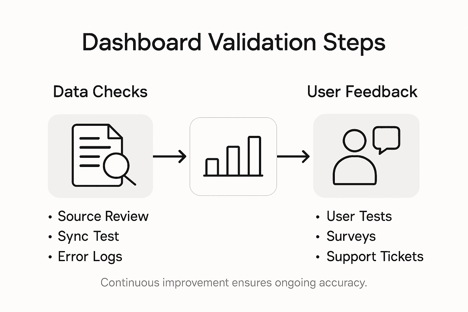
Begin by establishing rigorous data verification protocols. Cross reference data points from multiple sources, implement automated error detection mechanisms, and create validation rules that flag potential inconsistencies. Conducting UX/UI audits improves analytics dashboards by assessing usability heuristics and interface clarity, which means your validation process should include both technical accuracy and user experience assessment.
Key validation strategies include:
- Automated data reconciliation checks
- Performance benchmarking under different load conditions
- User journey mapping and interaction flow analysis
- Accessibility compliance testing
- Cross device and browser compatibility verification
Establish a continuous feedback loop with actual users. Collect both quantitative metrics like load times and bounce rates and qualitative insights through direct user interviews. This approach ensures your dashboard not only presents accurate data but does so in a way that feels intuitive and valuable to different user roles.
Pro tip: Schedule quarterly comprehensive audits to proactively identify and resolve potential data integrity or usability issues before they impact user trust.
Frequently Asked Questions
How can I identify key metrics for my SaaS reporting dashboard?
Start by aligning metrics with your core business objectives, such as user engagement and customer acquisition cost. Prioritize acquisition, revenue, and operational metrics to ensure you track what truly drives growth.
What technology stack should I choose for my custom reporting dashboard?
Select a tech stack that supports data source compatibility and real-time synchronization. Look for solutions that allow easy integration, provide security, and can scale as your needs grow.
How do I design a user-friendly architecture for my reporting dashboard?
Focus on clarity and logical organization when designing your dashboard. Use a clear visual hierarchy and group metrics by function, ensuring that users can quickly find the information relevant to their roles.
What interactive features should I include in my SaaS dashboard?
Implement features like clickable chart elements, dynamic filtering, and real-time data refresh. These enhancements allow users to explore data more effectively, making it easier to gain meaningful insights.
How can I ensure data accuracy in my reporting dashboard?
Establish rigorous data verification protocols to cross-check data from different sources. Regularly conduct usability audits to identify inaccuracies and improve the overall user experience.
How often should I review the metrics on my reporting dashboard?
Schedule quarterly reviews of your dashboard metrics to ensure they remain relevant and aligned with your evolving business strategy. This practice helps maintain clear performance snapshots and informs decision-making.

About the Author
Josh AndersonCo-Founder & CEO at Rule27 Design
Operations leader and full-stack developer with 15 years of experience disrupting traditional business models. I don't just strategize, I build. From architecting operational transformations to coding the platforms that enable them, I deliver end-to-end solutions that drive real impact. My rare combination of technical expertise and strategic vision allows me to identify inefficiencies, design streamlined processes, and personally develop the technology that brings innovation to life.
View Profile

