
Clean UI for productivity unlocks team efficiency, lowers cognitive load, and boosts engagement. See how SaaS teams benefit from intuitive admin systems.
Every product manager at a growing SaaS company knows the frustration of watching valuable team time slip away due to confusing admin interfaces. Clunky layouts, unclear navigation, and needless distractions sap productivity before the real work even begins. For American SaaS teams, clean user interface design can be the difference between daily operational headaches and seamless performance. This article clarifies what makes a UI truly clean and how focusing on clarity, consistency, and accessibility empowers your team to do their best work faster.
Key Takeaways
| Point | Details |
|---|---|
| Emphasize Clean UI | A clean user interface reduces cognitive load, enhancing team efficiency by allowing users to focus on their tasks instead of navigating complex systems. |
| Prioritize User Needs | Design admin systems based on real user needs, observing how team members interact with tools to eliminate friction points. |
| Ensure Consistency | Maintain consistent patterns across the interface to build user trust and minimize confusion, leading to fewer errors and faster adoption. |
| Incorporate Accessibility | Designing for accessibility from the start benefits all users and fosters an inclusive working environment, enhancing overall productivity. |
What Is Clean UI and Why It Matters
Clean user interface design isn’t about minimalism for its own sake. It’s about removing everything that distracts from what your team actually needs to accomplish. When you’re managing a growth-stage SaaS operation, your admin systems become the nervous system of your business. Every second your team spends hunting for a button or deciphering where data lives is a second they’re not closing deals, analyzing metrics, or shipping features.
User interface design exists for one purpose: to make interactions intuitive and efficient. In custom admin systems, clean UI translates directly into operational leverage. Your support team can resolve issues faster. Your data analysts can access reports without waiting for engineering. Your content team can publish updates without context switching. This isn’t theoretical. Companies we’ve worked with see operational efficiency gains of 40% after moving from cobbled-together tools to thoughtfully designed admin systems.
What makes clean UI actually work for your specific situation? It eliminates cognitive load. Your team isn’t struggling to remember where things are. Visual hierarchy guides them naturally to what matters. Information appears in the right order. Actions are obvious. The interface gets out of the way so people can think about their actual work instead of wrestling with the tool. This becomes exponentially more valuable as you scale, because every percentage point of efficiency compounds across larger teams.
The second reason clean UI matters is measurability. You can track whether your team is actually using features as intended. You can see where they get stuck. You can iterate based on real behavior rather than assumptions. For product managers specifically, this means you can make data-driven decisions about your internal tools the same way you do for customer-facing products. You can measure task completion rates, identify bottlenecks, and prioritize improvements that actually move the needle.
Here’s how clean UI principles impact SaaS admin system performance:
| Principle | Team Impact | Business Benefit |
|---|---|---|
| Reduced cognitive load | Faster onboarding, less confusion | Higher daily efficiency |
| Clear visual hierarchy | Faster task completion | Lower error rates |
| Built-in accessibility | More inclusive usage | Fewer support requests |
| Measurability | Track feature adoption | Informed product decisions |
Pro tip: When evaluating a custom admin system, test it with your actual users under real time pressure, not in a demo setting, to see whether the interface genuinely reduces friction or just looks clean.
Core Principles of a Clean User Interface
Building a clean interface isn’t about following design trends or making everything look minimal. It’s about understanding what your users actually need and architecting the system around those needs. For product managers overseeing custom admin systems, this means asking a different question: What would my team accomplish if the tool disappeared and they had to think about the work instead of the interface?
The first principle is starting with real user needs. You don’t design for an imaginary perfect user or for how you think the system should work. You design for your support team drowning in tickets, your operations manager tracking five different spreadsheets, your analyst who needs to validate data quality before publishing reports. Core design principles emphasize this approach: understand the actual problems people face, then solve those problems systematically. In practice, this means spending time in your systems watching how people work. Where do they get stuck? What information do they need together? What decisions require context switching between tools? Those friction points become your design priorities.

The second principle is clarity without compromise. Every element in your interface should have a reason to exist. Every label should say exactly what it means. Every action should lead somewhere predictable. Your finance team shouldn’t need to guess whether “finalize” means submit, save, or lock. Ambiguity creates support tickets. Ambiguity slows decisions. The principle extends to visual hierarchy too. What matters most should be obvious. Secondary options should be discoverable but not distracting. Information should flow in the order people actually need it. This becomes especially critical as your team grows because you can’t rely on tribal knowledge or someone who “just knows how it works.”
The third principle is accessibility as a baseline, not an afterthought. Accessibility design principles aren’t just about compliance or being nice to users with disabilities. They’re about building systems that work clearly for everyone, including your team members using the system in dark lighting, on mobile while in meetings, or while fatigued at the end of a long day. Color alone shouldn’t communicate meaning. Labels should be meaningful to screen readers. Keyboard navigation should be possible. When you build for accessibility from the start, you accidentally build a cleaner interface for everyone.
Pro tip: Test your admin interface with actual users performing real tasks under time pressure, then watch where their attention goes first and where they hesitate, which reveals your hierarchy and clarity problems.
How Clean UI Powers Team Productivity
Productivity isn’t about working harder. It’s about removing friction so your team can work on what actually matters. A clean UI does this by eliminating the thousand small delays that accumulate into lost hours. Your analyst doesn’t waste 15 minutes daily hunting for the right dashboard. Your operations manager doesn’t spend an hour consolidating data from three different interfaces. Your content team doesn’t context switch between systems trying to publish updates. These aren’t dramatic improvements. They’re systemic efficiency gains that compound across your entire organization.
Clean digital tools enable better collaboration and task effectiveness, particularly when teams are distributed or working asynchronously. The reason is straightforward: a well-designed interface reduces cognitive load. Your brain doesn’t waste energy trying to decode the system. That mental energy becomes available for actual problem-solving. Your data analyst can focus on interpreting results instead of fighting the visualization tool. Your support team can spend time thinking about solutions instead of navigating menus. This cognitive relief multiplies when you consider your entire team working eight hours a day. If clean UI saves each person 30 minutes daily through reduced friction and rework, that’s five hours per person per week across a team of ten. That’s the equivalent of adding someone to your payroll without the cost.
Another dimension of productivity that clean UI unlocks is decision velocity. When information is organized clearly, when dashboards show what matters, when reports load without waiting, your team makes decisions faster. Your product manager validates feature assumptions in hours instead of days. Your finance team closes the books without round-trip emails asking for clarification. Your marketing team launches campaigns because the data is already there, already clear, already trustworthy. Speed compounds too. Faster decisions mean faster iteration, which means faster learning, which means better outcomes. This becomes especially powerful when you’re combining clean UI with AI-powered features. Well-designed interfaces help users leverage complex tools like AI for brainstorming and problem-solving, enabling teams to accelerate project completion and unlock creative potential.
The productivity gain extends beyond speed into accuracy and quality. When your team isn’t struggling with the interface, they make fewer mistakes. Your operations team enters data more accurately because fields are clearly labeled. Your analysts catch errors more quickly because visualizations make patterns obvious. Your support team resolves tickets completely because all relevant information is available without searching. These quality improvements reduce rework, reduce fire-drills, and reduce the time spent fixing problems that shouldn’t have existed in the first place.
Pro tip: Track your team’s most time-consuming manual tasks before and after implementing a clean admin system to quantify the productivity gains you’re actually achieving, not just assuming they exist.
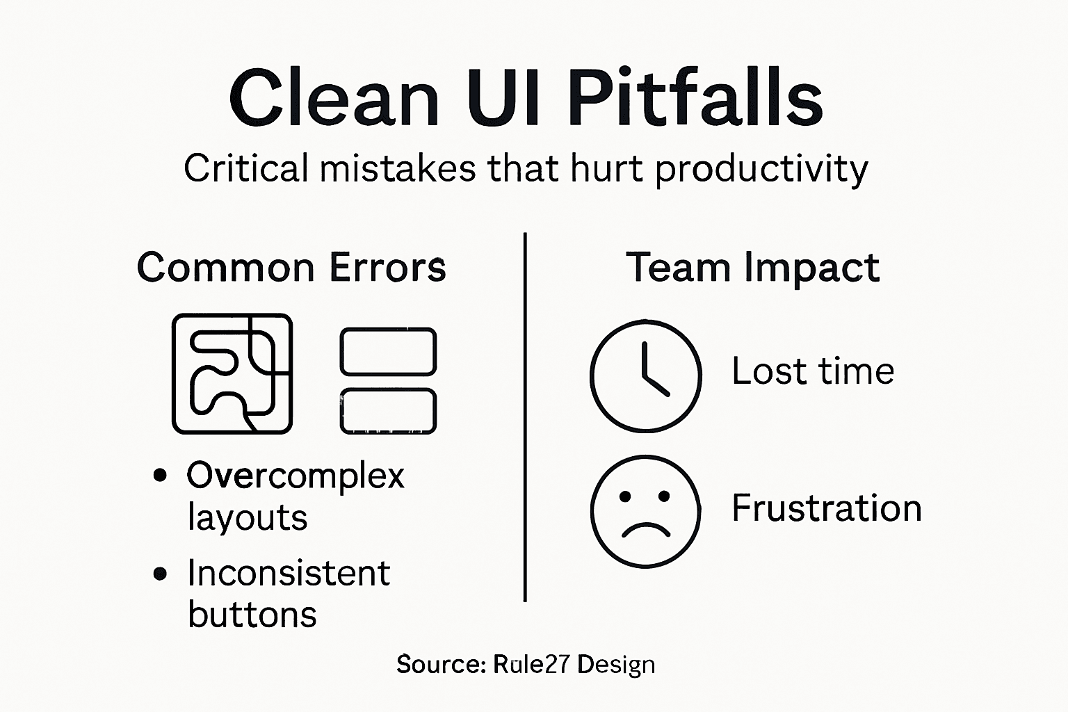
Common Pitfalls and Costly Mistakes
Most custom admin systems fail not because of technical limitations but because they were built without understanding how people actually work. You can invest six months and significant budget into a system that launches with all the features your team requested, only to discover nobody uses half of them because the interface creates more friction than it solves. The cost isn’t just the wasted development time. It’s the ongoing support burden, the training hours you’ll never recover, and the productivity loss that continues accumulating while you iterate toward something usable.
The most common mistake is building features without watching users. You ask your team what they need, they list features, you build them, and then you discover the features don’t solve the actual problem. Your finance team said they needed automated reconciliation, but what they actually needed was visibility into which transactions matched correctly and which didn’t. You built the automation without the visibility. Now they use your system to flag problems and manually reconcile anyway, defeating the purpose entirely. Common UI design pitfalls include overlooking user feedback and ignoring how people actually interact with interfaces, which leads to systems that frustrate users and require costly redesigns. The solution isn’t harder to find. It’s watching your team work before you code anything.
The second pitfall is overloading interfaces with information. You think more data density equals more powerful system. Your dashboard becomes a wall of widgets. Your data entry form has forty fields visible at once. Your navigation menu branches into five levels deep. What you’ve actually created is cognitive overwhelm. Your team spends mental energy filtering out irrelevant information instead of thinking about their work. They make mistakes because they’re scrolling past relevant context. They avoid the system because using it feels exhausting. Clean UI means showing what matters now and making everything else accessible without cluttering the view. This requires real decisions about information hierarchy, not just fitting everything visible.
The third pitfall is inconsistency across the system. One section uses buttons labeled “Save” while another uses “Submit.” One dashboard shows data sorted by date while another shows it by value. One workflow requires confirmation dialogs while another doesn’t. These inconsistencies aren’t stylistic preferences. They’re cognitive friction. Inconsistent design elements increase cognitive load and reduce usability, forcing your team to relearn how to interact with different sections. They also signal that the system wasn’t built with intention, which erodes trust. Your team starts assuming features are broken when they’re actually just inconsistent.
A fourth mistake that catches many growth-stage companies is ignoring mobile and accessibility from the start. You build for desktop thinking your team uses the system at their desk. Then your support team needs to check something while on a call. Your operations manager wants to approve workflows from their phone between meetings. Suddenly your system is unusable for 30 percent of their actual workload. Accessibility gets treated as an afterthought too, but it’s not just about compliance. When you design for accessibility, you accidentally solve problems for everyone. Better contrast helps people working in bright sunlight. Keyboard navigation helps people on video calls who can’t use a mouse. Screen reader compatibility forces you to label things clearly, which helps everyone.
Here’s a quick comparison of common admin UI pitfalls and their costs:
| Pitfall | Immediate Effect | Long-term Cost |
|---|---|---|
| Feature overload | User confusion, slower workflow | Higher training expenses |
| Inconsistent patterns | Increased mistakes, hesitation | Erosion of user trust |
| Ignoring mobile/accessibility | Reduced workforce flexibility | Missed productivity gains |
| Building without observation | Features don’t match real needs | Wasted development resources |
Pro tip: Before building any major feature, spend an hour watching three different team members perform the task your feature is supposed to support, then ask yourself whether your design actually addresses what you observed or just what they said they needed.
Design Tactics for Custom Admin Systems
Building a clean admin system requires deliberate design decisions, not random feature additions. You need a framework for thinking about what goes where, how information flows, and what your team actually needs to accomplish their work. The difference between a system people use and a system gathering dust comes down to intentional design choices made early and tested constantly.
Start with role-based design. Your finance team needs different information and workflows than your support team. Your content manager needs different controls than your data analyst. Instead of building one interface for everyone, design around specific roles and their actual responsibilities. This means your finance dashboard shows reconciliation status first. Your support team sees ticket volume and resolution time. Your analyst sees data quality metrics. User-centered design principles emphasize understanding user roles and prioritizing workflows to ensure each person gets the interface they need, not a generic one that works for nobody. Role-based design also simplifies your interface because each user only sees what’s relevant to their job.
The second tactic is progressive disclosure. Don’t show everything at once. Show what people need right now. Make advanced options discoverable but not overwhelming. Your operations team’s primary workflow might be reviewing pending approvals. That goes above the fold. Advanced filtering, bulk operations, and configuration live in expandable sections or secondary views. This keeps the interface focused while maintaining power for users who need it. It also makes onboarding faster because new team members see a simple interface first, then gradually discover deeper capabilities.
The third tactic is consistent patterns and components. Reusable components and consistent visual language reduce development time and improve usability across your entire system. When your team learns one pattern, they can apply it everywhere. Your confirmation dialogs look the same. Your data tables behave the same. Your error messages appear in the same location with the same visual treatment. This consistency feels invisible when it works, but your team notices immediately when it breaks. Consistency builds trust that the system works as expected.
The fourth tactic is information architecture that mirrors work. Don’t organize your navigation by technology or database structure. Organize it by how your team actually completes work. Your content team’s navigation should show “publish,” “review,” “schedule” rather than “posts,” “revisions,” “calendar.” Your finance team should see “close month,” “reconcile accounts,” “generate reports” rather than “ledgers,” “journals,” “statements.” When your system matches your team’s mental model of their work, navigation becomes obvious and features become discoverable.
The fifth tactic is clear feedback and error handling. When someone submits a form, they should know immediately whether it succeeded or what went wrong. When a process takes time, show progress. When data loads, indicate that explicitly rather than letting them wonder if the system is frozen. Error messages should be specific. Instead of “Error: validation failed,” say “The email address format is invalid. Please use name@company.com.” Your team shouldn’t need to guess what went wrong.
Pro tip: Create a design system document early that defines your button styles, form patterns, error messages, and navigation conventions, then enforce it ruthlessly across all your admin interfaces to maintain consistency as you build new features.
Frequently Asked Questions
What is a clean user interface (UI) and why is it important for productivity?
A clean user interface (UI) is designed to minimize distractions and streamline interactions, making tasks more intuitive and efficient. It is important for productivity because it allows teams to focus on their work rather than struggling with complex, cluttered interfaces, which can lead to significant operational efficiency gains.
How does a clean UI reduce cognitive load for teams?
A clean UI reduces cognitive load by eliminating unnecessary elements and providing a clear visual hierarchy. This allows team members to find what they need quickly, leading to faster task completion and reduced confusion, which is especially beneficial as teams scale.
What are the measurable benefits of implementing a clean UI in SaaS admin systems?
Implementing a clean UI allows businesses to track feature usage, identify where users get stuck, and measure task completion rates. These insights lead to data-driven decisions for improvements and can significantly enhance operational efficiency and team productivity.
What common mistakes should be avoided when designing a clean admin interface?
Common mistakes include building features without observing user needs, overloading interfaces with excessive information, inconsistencies in design elements, and neglecting mobile and accessibility considerations. Avoiding these pitfalls can prevent wasted resources and enhance user experience.

About the Author
Josh AndersonCo-Founder & CEO at Rule27 Design
Operations leader and full-stack developer with 15 years of experience disrupting traditional business models. I don't just strategize, I build. From architecting operational transformations to coding the platforms that enable them, I deliver end-to-end solutions that drive real impact. My rare combination of technical expertise and strategic vision allows me to identify inefficiencies, design streamlined processes, and personally develop the technology that brings innovation to life.
View Profile

