
Learn how to design user dashboards step-by-step for SaaS platforms. This guide covers every phase, from user research to launch and refinement.
Overwhelmed by dashboards that flood your team with numbers but offer little clarity? For product managers at growth-stage SaaS companies in the United States, building dashboards that truly amplify operational efficiency requires moving beyond generic data displays. By focusing on defining user roles and clear dashboard objectives, you pave the way for tools that target the unique needs of every stakeholder and drive sharper decision-making across the company.
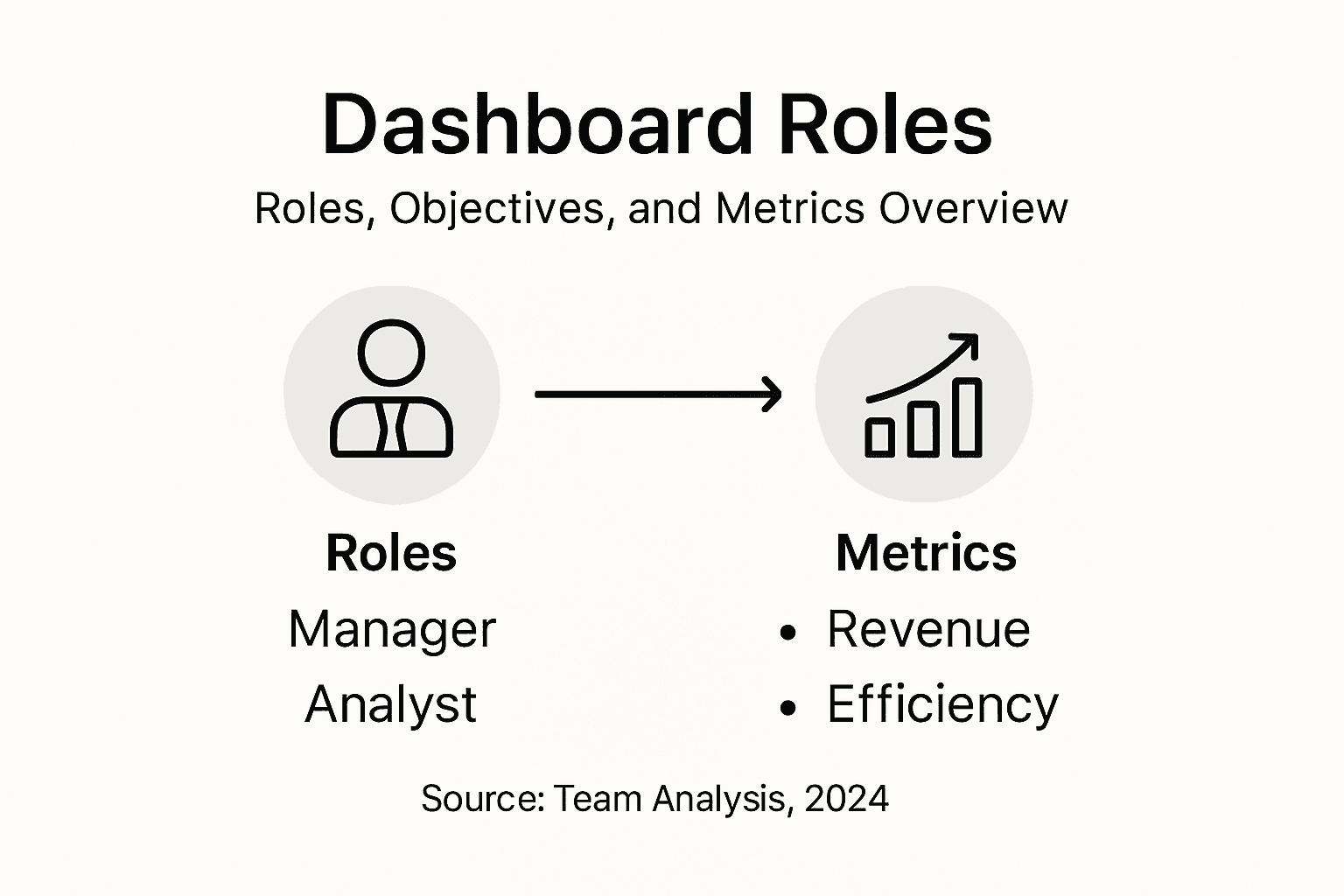
Step 1: Define User Roles and Dashboard Objectives
Defining user roles and dashboard objectives sets the strategic foundation for creating powerful administrative systems that actually drive operational efficiency. You will map out exactly who needs what information and why, transforming your dashboard from a generic data display into a targeted productivity tool.
Start by conducting a comprehensive user analysis that identifies specific information needs across different organizational roles. Product managers will require different insights compared to finance teams or executive leadership. Break down each user group and document their primary goals performance metrics they track and decisions they need to support. A marketing director might want conversion rate trends while a sales manager needs pipeline velocity metrics.
Next create a detailed matrix mapping user roles to their specific dashboard objectives. For each role specify the precise data points key performance indicators and visualization preferences. This granular approach ensures your dashboard provides targeted actionable insights rather than generic data overload. Consider factors like user technical proficiency data literacy and preferred interaction methods to design an interface that feels intuitive and genuinely helpful.
Here’s a summary of key dashboard user roles and their core objectives:
| User Role | Primary Objective | Key Metrics | Preferred Visualization |
|---|---|---|---|
| Marketing Director | Track conversion rate trends | Conversion rates, campaign ROI | Line graphs, bar charts |
| Sales Manager | Monitor pipeline velocity | Pipeline stage speed, lead sources | Funnel diagrams, heat maps |
| Product Manager | Analyze product performance | Feature usage, bug reports | Trend lines, area charts |
| Finance Team | Oversee financial health | Revenue, expenses, profit | Pie charts, tables |
| Executive Leader | Make strategic decisions | High-level KPIs, growth rates | Dashboards, summaries |
Pro tip: Conduct brief stakeholder interviews to validate your role and objective assumptions before finalizing the dashboard design strategy.
Step 2: Map Data Sources and Connect Integrations
Successfully mapping data sources and establishing robust integrations transforms your dashboard from a static display into a dynamic operational command center. In this step, you will create a comprehensive blueprint that connects diverse data streams into a unified intelligence platform.
Begin by conducting a thorough inventory of your existing data repositories. Comprehensive data integration techniques require understanding every potential data source across your organization. List out all relevant databases, cloud platforms, spreadsheets, CRM systems and third party tools that contain valuable information. Pay special attention to platforms like Salesforce, Google Analytics, financial management systems and internal databases that generate critical performance metrics.
Next focus on designing a robust integration architecture that harmonizes these disparate data sources. Evaluate each source for compatibility examining data formats connection protocols and potential transformation requirements. Consider using middleware platforms or custom API connectors that can standardize data inputs and ensure smooth information flow. Prioritize solutions that offer real time synchronization and support advanced data normalization processes to eliminate inconsistencies and redundancies.
Compare the main dashboard integration methods and their business impact:
| Integration Method | Compatibility | Data Sync Speed | Business Impact |
|---|---|---|---|
| Middleware Platform | Broad (most tools) | Near real-time | Simplifies integrations |
| Custom API Connector | Customizable | Real time | Enables tailored solutions |
| Direct Database Link | Limited (same tech) | Fastest | Immediate data access |
| CSV Import/Export | Universal | Manual/Delayed | Enables ad hoc uploads |
Pro tip: Create a detailed data source mapping spreadsheet with columns for source name connection method data types and integration status to track your progress systematically.
Step 3: Design Intuitive Layouts and Key Components
Crafting an intuitive dashboard layout transforms raw data into actionable insights that drive strategic decision making. You will design a visual experience that guides users effortlessly through complex information landscapes while highlighting the most critical metrics and performance indicators.

Start by establishing clear visual hierarchy that immediately draws attention to the most important data points. Group related metrics into logical sections using consistent color schemes white space and alignment principles. Consider your primary user roles and their specific information needs when arranging components. A sales executive might want pipeline summaries front and center while a product manager needs granular performance trends.
Focus on creating modular components that can be easily customized and rearranged. Prioritize clean minimalist designs that eliminate visual clutter and cognitive overload. Implement responsive grid systems that adapt seamlessly across different screen sizes and devices. Ensure each visualization tells a clear story leverage chart types like line graphs bar charts and heat maps that communicate trends and comparisons instantly. Color code metrics strategically using intuitive signals green for positive trends red for potential issues and neutral tones for stable performance.
Pro tip: Conduct user testing with actual dashboard stakeholders to validate your layout design and gather feedback on component placement and visual clarity.
Step 4: Implement Interactive Features and Visualizations
Transforming your dashboard from a static display into a dynamic intelligence platform requires strategic implementation of interactive features that empower users to explore and understand data intuitively. You will design an experience that allows deep data engagement through smart visualization techniques.
Interactive dashboard mechanics start with building robust filtering and drill down capabilities. Implement dropdown menus time range selectors and clickable chart elements that allow users to slice data dynamically. Consider adding features like hover tooltips that reveal additional context zooming functions for detailed analysis and cross filtering between different visualizations. These interactions transform raw numbers into storytelling experiences that adapt to each user’s specific exploration needs.
Focus on creating seamless interaction models that feel natural and intuitive. Design click interactions that provide progressive disclosure of information revealing deeper insights without overwhelming users. Use color coding hover states and subtle animations to guide users through complex data landscapes. Prioritize performance ensuring that interactive elements load quickly and respond smoothly across different devices and network conditions.
Pro tip: Prototype multiple interaction models and conduct user testing to validate which interactive features provide the most intuitive and efficient data exploration experience.
Step 5: Test Dashboard Usability and Gather Feedback
Evaluating dashboard usability is a critical process that transforms your initial design into a user-centered tool that delivers real operational value. You will systematically validate your dashboard design through structured testing and comprehensive user feedback collection.
Usability evaluation frameworks provide structured approaches to assessing dashboard effectiveness. Begin by recruiting a diverse group of representative users who match your target audience. Implement standardized assessment tools like the System Usability Scale (SUS) and Technology Acceptance Model (TAM) to gather quantitative insights. Develop specific test scenarios that mirror real world workflows allowing participants to interact with the dashboard while tracking key metrics such as task completion time navigation efficiency and overall user satisfaction.
Create a comprehensive feedback mechanism that captures both qualitative and quantitative data. Conduct moderated usability sessions where you observe users interacting with the dashboard in real time. Record their verbal comments screen interactions and emotional responses. Use a mix of structured questionnaires open ended interviews and direct observation to uncover subtle usability challenges. Pay close attention to areas where users hesitate struggle or express confusion. These moments often reveal critical design improvements that can significantly enhance the dashboard’s overall user experience.
Pro tip: Schedule multiple rounds of usability testing with different user groups to capture diverse perspectives and iteratively refine your dashboard design.
Step 6: Optimize Dashboard Performance and Launch
Preparing your dashboard for a successful deployment requires strategic performance optimization and thoughtful implementation. You will transform your meticulously designed dashboard into a robust operational tool that delivers lightning fast insights and exceptional user experience.
Human-centered design principles emphasize the importance of performance and scalability during dashboard launch. Start by conducting comprehensive performance testing that simulates realistic user loads and interaction patterns. Implement aggressive data caching strategies to minimize query response times. Prioritize key metrics and optimize database queries to ensure that critical information loads instantaneously. Consider using server side rendering techniques and progressive loading mechanisms that display essential data first while background processes retrieve additional details.
Create a phased rollout strategy that allows controlled dashboard deployment across different user groups. Begin with a small pilot group of power users who can provide immediate technical and usability feedback. Monitor system performance closely tracking metrics like load times user engagement and error rates. Develop robust monitoring dashboards that track the dashboard’s own performance providing real time insights into its operational health. Establish clear communication channels for user feedback and be prepared to make rapid iterations based on initial user experiences.
Pro tip: Set up automated performance monitoring tools that continuously track dashboard responsiveness and send immediate alerts if key performance thresholds are breached.
Unlock Dashboard Efficiency with Custom Solutions Tailored to Your Team
Designing user dashboards that truly drive efficiency is about more than just displaying data. It means understanding specific user roles, mapping data sources, crafting intuitive layouts, and embedding interactive features that unleash actionable insights. If you are struggling with generic tools that overwhelm rather than empower, or complex enterprise software that feels like overkill, you are not alone.
At Rule27 Design we specialize in creating custom administrative systems and internal tools designed to fit exactly how your team works. We help growth-stage companies overcome challenges like data fragmentation, poor usability, and slow dashboard performance by building targeted dashboards with clean interfaces and robust backend architecture. Our solutions unlock benefits such as:
- Clear visual hierarchy and modular components tailored to your user roles
- Seamless integrations that unify your disparate data sources in real time
- Interactive elements that encourage deep exploration and smarter decision making
Experience how custom dashboards can transform your operations.
Ready to stop settling for dashboards that miss the mark Try partnering with Rule27 Design to create user-focused admin panels and business intelligence tools that scale with your company. Visit our landing page now and see how we deliver up to 40 percent operational efficiency improvements through tailored systems that just work.
Frequently Asked Questions
How do I define user roles for my dashboard?
Defining user roles involves identifying the different stakeholders who will use the dashboard and documenting their specific information needs. Start by conducting a user analysis to map out the goals and key metrics for each role within your organization.
What are the best practices for mapping data sources for a dashboard?
Begin by creating a comprehensive inventory of all potential data sources within your organization, including databases, spreadsheets, and third-party tools. Design an integration architecture that ensures these disparate sources can communicate smoothly and keep data up to date in real time.
How can I ensure my dashboard is user-friendly?
To create a user-friendly dashboard, establish a clear visual hierarchy that highlights the most critical metrics and groups related data. Use consistent color schemes and modular components that can be easily customized to accommodate the user’s needs and preferences.
What interactive features should I implement for better engagement?
Incorporate interactive elements such as filters, dropdown menus, and clickable charts to enhance user engagement. These features allow users to dynamically explore data, helping them gain insights tailored to their specific queries and analyses.
How can I test the usability of my dashboard?
Conduct usability testing by enlisting representative users to interact with the dashboard while tracking their performance and satisfaction. Use standardized assessment tools to gather quantitative data along with qualitative feedback to identify areas for improvement and enhance user experience.
What steps should I take for launching my dashboard effectively?
Start with thorough performance testing to ensure the dashboard can handle user loads efficiently. Implement a phased rollout strategy, beginning with a pilot group of users to gather immediate feedback and monitor performance metrics for swift improvements.

About the Author
Josh AndersonCo-Founder & CEO at Rule27 Design
Operations leader and full-stack developer with 15 years of experience disrupting traditional business models. I don't just strategize, I build. From architecting operational transformations to coding the platforms that enable them, I deliver end-to-end solutions that drive real impact. My rare combination of technical expertise and strategic vision allows me to identify inefficiencies, design streamlined processes, and personally develop the technology that brings innovation to life.
View Profile

