
Discover how to design intuitive dashboards step by step to boost collaboration and operational efficiency. Follow this guide to create usable, scalable insights.
Designing dashboards that actually support your team’s goals can feel challenging for many American SaaS product managers. Instead of overwhelming users with endless metrics, aligning dashboard design with specific user objectives and decision contexts leads to better operational efficiency and more productive collaboration. This article offers practical steps to help you pinpoint user needs, choose relevant data, and structure interactive elements for clear, actionable insights.
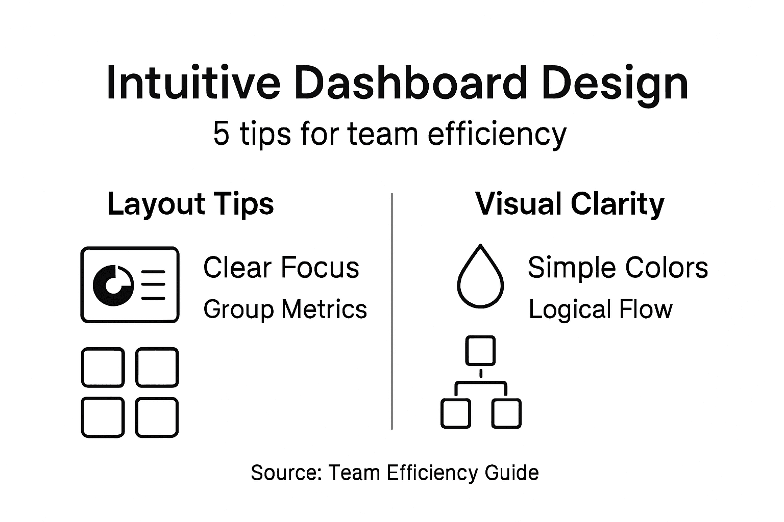
Step 1: Identify key user goals and data needs
Designing an intuitive dashboard starts with understanding exactly what your team needs to accomplish. Comprehensive user research principles reveal that successful dashboards are built around specific user objectives, not generic data displays.
To effectively map out user goals and data requirements, you’ll want to follow a systematic approach:
- Schedule user interviews with key stakeholders in each department
- Document specific tasks each team member needs to complete
- Analyze current workflow bottlenecks and information gaps
- Identify decision-making triggers that require quick data access
Begin by creating detailed user personas representing different roles within your organization. A product manager might need real-time performance metrics, while a sales representative requires lead conversion data. Map out these specific needs through direct conversations and careful observation.

Here’s a summary mapping typical dashboard user roles to their data needs and objectives:
| User Role | Primary Objective | Key Data Needed |
|---|---|---|
| Product Manager | Monitor feature performance | Real-time usage metrics |
| Sales Representative | Increase conversion rates | Lead status and pipeline data |
| Marketing Analyst | Optimize campaign results | Engagement and demographic trends |
| Support Specialist | Resolve user issues quickly | Ticket volume and response times |
| Executive Leader | Track strategic progress | High-level KPIs and targets |
Understanding user context is more important than collecting massive amounts of data.
Create a matrix that connects user roles, their primary objectives, and the precise data points that support those goals. This approach ensures your dashboard design remains laser-focused on practical utility.
Pro tip: Conduct brief 30-minute shadowing sessions with team members to observe their actual workflow and uncover hidden data requirements.
Step 2: Select relevant metrics and layout components
Choosing the right metrics and dashboard layout is critical for transforming raw data into actionable insights. Dashboard design strategies emphasize presenting focused metrics that directly address users’ key decision-making needs.
When selecting metrics, focus on these critical principles:
- Prioritize key performance indicators that drive strategic decisions
- Limit total metrics to 5-7 per dashboard view
- Select visualization types that match data complexity
- Arrange components in a logical narrative flow
Start by mapping each metric to a specific business objective. For instance, a sales dashboard might include conversion rates, average deal size, and pipeline velocity. The goal is creating a visual story that guides users toward meaningful insights and actions.
Not all data is dashboard-worthy. Choose metrics that spark immediate understanding.
Consider the cognitive load for users by selecting chart types that communicate information instantly. Line graphs work best for trends, while bar charts compare categorical data effectively. Ensure each component provides clear context and supports quick decision-making.
Below is a comparison of popular chart types and when to use them for dashboard clarity:
| Chart Type | Best Use Case | Data Complexity Level | User Benefit |
|---|---|---|---|
| Line Graph | Tracking trends over time | Moderate | Quickly see performance changes |
| Bar Chart | Comparing categories | Low | Easy comparisons at a glance |
| Pie Chart | Showing proportions | Simple | Visual breakdown of shares |
| Scatter Plot | Highlighting data relationships | Advanced | Spot patterns and correlations |
Pro tip: Create a “metrics priority pyramid” where your most critical KPIs occupy the most prominent dashboard real estate.
Step 3: Structure interactive elements for clarity
Creating an intuitive dashboard means designing interactive elements that guide users effortlessly through their data exploration journey. Dashboard interaction principles emphasize placing controls and filters strategically to minimize user confusion and maximize understanding.
When structuring interactive dashboard components, focus on these key design strategies:
- Position critical controls at the top or near relevant data sections
- Group related interactive elements for logical navigation
- Use consistent color and typography for visual predictability- Minimize the number of interaction steps required to access insights
Think of your dashboard as a guided tour. Users should be able to drill down, filter, and explore data with minimal cognitive effort. For instance, place time range selectors near time-based charts, and ensure filter panels are compact yet clearly labeled.
Interactive elements should feel like helpful assistants, not complicated puzzles.
Consider implementing contextual tooltips that provide additional information when users hover over specific data points. This approach helps users understand complex metrics without overwhelming them with unnecessary details.
Pro tip: Create a “interaction map” before implementation to visualize how users will navigate and interact with different dashboard components.
Step 4: Apply visual hierarchy and accessibility best practices
Building an effective dashboard means creating a visual experience that guides users’ attention intuitively and ensures everyone can access critical information. Dashboard design principles emphasize using strategic visual cues to direct focus and support diverse user needs.
To establish a clear visual hierarchy and maximize accessibility, implement these core strategies:
- Use size and placement to highlight most important metrics
- Create color contrast that supports clear information reading
- Design consistent navigation patterns across dashboard sections
- Provide alternative text for critical chart and graphic elements
Think of your dashboard like a well-organized newspaper. The most critical information should be largest and positioned where users’ eyes naturally land first. This means placing key performance indicators in prominent positions with larger fonts and bolder colors compared to supporting data.
Accessibility is not an afterthought. It’s a fundamental design requirement.
Consider color choices carefully to support users with visual differences. Use color combinations that maintain sufficient contrast, and avoid relying solely on color to communicate important information. Include text labels, patterns, and alternative visual indicators to ensure comprehensive understanding.
Pro tip: Run your dashboard design through accessibility checkers and color contrast analyzers to validate usability for all users.
Step 5: Test usability and iterate based on feedback
Developing an outstanding dashboard requires continuous refinement through systematic user testing and feedback collection. User design evaluation strategies demonstrate how targeted feedback can dramatically improve system usability and effectiveness.
To conduct comprehensive usability testing, implement these strategic approaches:
- Recruit diverse test participants representing your actual user base
- Design structured testing scenarios that mimic real-world usage
- Collect quantitative and qualitative feedback through multiple channels
- Document specific usability challenges and user pain points
Consider running both moderated and unmoderated testing sessions. In moderated sessions, observe users directly as they interact with your dashboard, noting where they hesitate or struggle. Unmoderated sessions using screen recording can provide additional insights into natural user behavior without potential observer bias.
Feedback is a gift. Treat each critique as an opportunity to improve.
Establish a systematic approach to incorporating user suggestions. Create a feedback prioritization matrix that evaluates each recommendation based on implementation difficulty, potential user impact, and alignment with core dashboard objectives. This ensures you’re making strategic improvements rather than random changes.
Pro tip: Create a “feedback log” that tracks all user suggestions, their implementation status, and the rationale behind design decisions.
Unlock Seamless Team Efficiency with Custom Dashboard Solutions
Struggling to design intuitive dashboards that truly match your team’s workflow can slow down decision making and obscure critical data insights. This article highlights the importance of understanding user goals, selecting focused metrics, and applying visual hierarchy to create dashboards that improve operational efficiency. At Rule27 Design we specialize in turning these complex challenges into streamlined solutions tailored for your business needs.
Discover how our expertise in building custom admin panels and digital infrastructures enables your team to effortlessly access relevant data with clear interactive elements. Experience the difference of dashboards designed around your actual workflows backed by advanced technology like React and AI integration. Visit Rule27 Design and explore how our tailored systems deliver meaningful improvements in efficiency and content performance today. Ready to transform your data into actionable insights Start your journey with us now.
Frequently Asked Questions
How can I identify key user goals for my dashboard design?
To identify key user goals, schedule interviews with key stakeholders within your organization and document the specific tasks they need to accomplish. Create detailed user personas that represent different roles to ensure your dashboard targets their unique objectives.
What metrics should I prioritize when designing a dashboard?
When designing a dashboard, prioritize key performance indicators that drive decision-making for the relevant team. Limit your selection to 5-7 metrics per view to enhance clarity and impact, ensuring that each metric directly aligns with user objectives.
How do I arrange interactive elements on my dashboard for user clarity?
To enhance user clarity, position critical controls at the top of your dashboard and group related interactive elements logically. Ensure that users can access insights with minimal steps, creating a streamlined and efficient navigation experience.
What visual design principles should I follow for dashboard accessibility?
Focus on establishing a clear visual hierarchy by using size and placement to highlight the most important metrics. Additionally, create sufficient color contrast and provide alternative text for critical visual elements to ensure your dashboard is accessible to all users.
How can I effectively test my dashboard’s usability?
To test usability, recruit diverse participants that represent your actual user base and create structured testing scenarios. Collect both quantitative and qualitative feedback to identify specific user challenges and pain points for actionable improvement.
What steps should I take after receiving user feedback on my dashboard?
After receiving feedback, document the suggestions in a feedback log and prioritize them based on user impact and implementation difficulty. Aim to incorporate valuable recommendations within a 30-day timeframe to improve your dashboard effectively.

About the Author
Josh AndersonCo-Founder & CEO at Rule27 Design
Operations leader and full-stack developer with 15 years of experience disrupting traditional business models. I don't just strategize, I build. From architecting operational transformations to coding the platforms that enable them, I deliver end-to-end solutions that drive real impact. My rare combination of technical expertise and strategic vision allows me to identify inefficiencies, design streamlined processes, and personally develop the technology that brings innovation to life.
View Profile

