
Discover why seamless user interfaces are crucial for SaaS growth and retention. Learn to enhance user experience and prevent churn!
TL;DR:
- Most UI failures become visible during real user interactions rather than in prototypes, causing churn. True seamlessness reduces interaction costs, simplifies tasks, and minimizes cognitive load to improve activation and retention. Ongoing measurement, strategic friction application, and testing edge cases are essential to maintain and enhance a seamless user experience.
Most UI failures don’t show up in your prototype review. They show up at 9 a.m. on a Monday when a new user clicks the wrong button, hits a confusing error state, and quietly churns. Seamless UI isn’t about clean gradients or tight spacing. It’s about whether your users can get things done without thinking too hard. For growth-stage SaaS teams, that gap between “looks great in Figma” and “works great in production” is where activation rates die and retention numbers stall.
Key Takeaways
| Point | Details |
|---|---|
| Seamless UI means less friction | True seamlessness comes from reducing effort, steps, and confusion in every user flow. |
| Activation metrics reveal friction | Track onboarding time, completion rates, and corrections to locate and fix hidden UI roadblocks. |
| Balance seamlessness with smart friction | Adaptive UI should introduce validation steps for higher-risk users, not remove all obstacles blindly. |
| Edge cases make or break quality | Test all interaction states and edge conditions to ensure seamlessness holds up beyond ideal paths. |
| Seamlessness requires ongoing validation | Measure and benchmark your UI experience regularly, not just during initial design updates. |
What makes user interfaces seamless?
Most product teams define “seamless” as visually consistent. Consistent fonts, aligned grids, matching button styles. That’s table stakes. Real seamlessness is something else entirely.
A seamless UI is mainly about reducing interaction cost, fewer steps, fewer clicks, clearer next actions, and predictable behavior, so users complete tasks with minimal effort and training. That’s the operational definition. And it changes how you think about design decisions.
Cognitive load is the metric that matters. Every extra step, every ambiguous label, every misplaced button is a small tax on your user’s attention. Pile enough of those taxes together and users stop feeling productive. They feel frustrated. Then they stop showing up.
The best way to understand this is to compare how seamless and non-seamless admin flows actually feel in practice. Here’s a quick side-by-side:
| Scenario | Non-seamless experience | Seamless experience |
|---|---|---|
| Adding a new team member | 4 screens, 3 confirmation dialogs | One modal, one click to confirm |
| Updating a setting | Buried in sub-menus, no breadcrumb | Searchable settings, persistent breadcrumb |
| Recovering from an error | Generic “something went wrong” message | Inline error with specific correction steps |
| Finding a recent action | No activity log or undo function | Visible recent activity, one-click undo |
| Completing onboarding | Disconnected steps, no progress indicator | Progress bar, contextual tooltips, auto-save |
Notice how the non-seamless column isn’t broken. It’s just slow, effortful, and slightly confusing. That’s what kills SaaS growth. Not crashes. Friction.
Good UI design best practices reinforce three baseline principles for seamlessness:
- Easy navigation: Users should know where they are and where they can go next without hunting.
- Clear next steps: Every screen should have an obvious primary action. If users have to decide between five equal options, that’s a design failure.
- Consistent behaviors: Buttons should behave the same way everywhere. Links should look like links. Saving should feel the same in every module.
Pro Tip: Don’t start your seamlessness audit on your landing page. Start with onboarding and the most common admin tasks your power users run daily. That’s where friction accumulates fastest and hurts growth most.
How seamless UI transforms key SaaS moments
Seamlessness isn’t a feature. It’s an outcome. And that outcome shows up most clearly during onboarding and early activation.
Onboarding friction is measurable in very specific ways: time-to-first value, error correction rates, step completion time, and drop-off points. When you map these signals across your onboarding flow, you stop guessing about where users struggle and start seeing real patterns.
Here’s what that looks like in numbers. When teams reduce onboarding steps and simplify early task flows, activation rates climb. Here’s a snapshot of how step reduction correlates with outcomes:
| Onboarding change | Activation rate impact | Time-to-value change |
|---|---|---|
| Removed 2 redundant confirmation steps | +12% | Reduced by 4 minutes |
| Added inline error correction | +18% | Reduced by 6 minutes |
| Replaced 3-screen setup with 1 guided modal | +25% | Reduced by 11 minutes |
| Added progress indicator to multi-step flow | +9% | Reduced by 2 minutes |
These aren’t abstract UX wins. They’re directly tied to your activation rate, which is one of the strongest predictors of long-term retention. When users hit value faster, they’re more likely to return. When they get stuck, they’re more likely to churn quietly.
Here’s a concrete example of how streamlining a typical SaaS onboarding flow plays out step by step:
- User signs up. If the first screen is a wall of form fields, many users drop off immediately. Reduce to the minimum required fields. Ask for more later, in context.
- User sets up their workspace. If this requires navigating to a settings page, finding the right section, and saving manually, friction builds. A guided setup wizard with auto-save removes that entirely.
- User invites their team. A “skip for now” option is critical. Forcing team invitations before the user sees value is a well-documented friction point.
- User completes a first meaningful action. This is the activation milestone. If your interface makes this action obvious and quick, you win. If it’s buried or confusing, you’ve lost them.
- User returns the next day. A seamless return experience means picking up exactly where they left off, with a visible next action. A clunky return experience means starting over mentally.
Benchmarking onboarding against your targets and competitors is more useful than measuring against your own history in isolation. Your team’s internal perception of what feels “smooth” drifts over time. External benchmarks keep you honest.
Improving your SaaS processes around onboarding isn’t a one-quarter project. It’s a continuous feedback loop, and workflow efficiency strategies built into your operations help sustain that loop without burning out your product team.
Managing the trade-off: Stability, speed, and risk
Here’s where seamless UI gets more nuanced. Sometimes friction is a feature, not a bug.
Risk-aware onboarding is the practice of keeping the experience frictionless for low-risk users while adding verification steps only when the risk level warrants it. A new user adding a team member from a known domain? Let that flow fast. A user attempting to move funds or change billing details? Step-up verification is appropriate there.
Removing all friction isn’t the goal. Right-sizing friction to context is the goal. That distinction is easy to lose when your entire team is pushing to simplify.
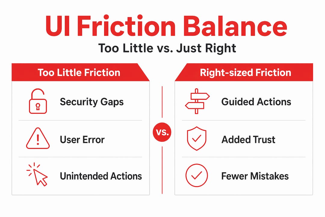
There’s also a real design trade-off in seamless interfaces involving stability and dynamism. Live data, real-time updates, and streaming content can shift layouts, cause scroll position jumps, and introduce “jank” that destroys the feeling of a polished experience. You have to engineer stability intentionally rather than assume your dynamic features will behave smoothly.
Here’s a comparison of pure seamlessness versus adaptive, risk-stratified UX:
| Approach | What it optimizes for | Risk and drawbacks |
|---|---|---|
| Pure seamlessness | Speed, zero friction | Exposes security gaps, removes important guardrails |
| Adaptive/risk-stratified UX | Contextual friction | Slightly more complex to build, but much safer and smarter |
| No strategy | Default behavior from tools | Inconsistent experience, unpredictable trust signals |
Areas where forced friction actually benefits your users and your business:
- Payment and billing changes: A confirmation step reduces accidental charges.
- Deleting data: An undo window or confirmation dialog prevents catastrophic mistakes.
- Sharing sensitive content externally: An explicit permission check builds trust.
- High-frequency actions in short windows: Rate limiting protects both users and your system.
- Account-level permission changes: Role changes should never be one-click by accident.
Building operational efficiency into your SaaS product means knowing where to add smart friction and where to strip it away. That judgment call is what separates mature product teams from ones still treating seamlessness as a cosmetic project.
Testing for true seamlessness: States, edge cases, and real users
After you’ve engineered stability and right-sized friction, you still need to validate that seamlessness holds up under real conditions. This is where most teams fall short.

Seamless interfaces require designing for edge cases and interaction states, including loading, empty, error, and responsive breakpoints, because many issues don’t appear in static mockups. Your Figma file has none of these. Your users encounter all of them.
The states most commonly skipped in QA and design reviews:
- Loading state: Does the interface communicate that something is happening? A blank screen during a slow API call looks broken.
- Empty state: What does a brand-new user see when no data exists yet? Empty tables with no guidance are a silent conversion killer.
- Error state: Is the error message specific? Does it tell users what to do next? “Something went wrong” is useless.
- Success state: Do users know the action completed? A missing confirmation creates repeat submissions and confusion.
- Invalid input state: Are validation errors inline and clear, or do they appear after full form submission?
- Rapid repeat clicks: What happens when a user double-clicks a submit button? Does your system handle it gracefully?
- Responsive breakpoints: Does your admin panel work on a 13-inch laptop screen, not just your 27-inch monitor?
Pro Tip: Before every major release, run a quick checklist across all six interaction states for any new flow you’re shipping. It takes 30 minutes and catches the issues that users would otherwise find on day one.
Web page optimization isn’t just for marketing pages. Fast load times and stable rendering in your app’s core flows directly affect how “seamless” the product feels, even if design quality is high. If a screen takes 3 seconds to load, the experience isn’t seamless, regardless of how polished the UI is.
Using heuristic evaluation guidance gives your team a structured framework for catching design issues before they hit production. Heuristic evaluation means checking your interface against established usability principles, like visibility of system status, user control, and error prevention. It’s faster than full usability testing and catches a surprising number of real friction points.
Cross-device testing surfaces a specific category of friction that’s easy to miss: touch target size, hover-dependent interactions, and truncated text. If your admin panel is used on a laptop during travel or on a smaller screen, those friction points compound fast.
What most SaaS teams miss about seamless UI
Here’s the honest take. Most teams treat seamless UI as a project that ends. They do a redesign, celebrate the launch, and move on. Six months later, new features have quietly accumulated friction. Onboarding flows have new steps. Settings screens have grown. Nobody re-audited anything.
The teams winning on UI seamlessness treat it as an ongoing instrumentation problem. They measure completion rates at every step. They track where users edit or backtrack. They watch time-on-task trending up as a warning signal. They use these signals to decide what to fix next.
A practical methodology for decision-makers is to treat seamless UI as an outcomes system rather than a design aesthetic. Reduce effort, reduce uncertainty, then instrument activation milestones and step-level friction signals: completion rates, time-on-task, error correction frequency, drop-off rates, and step-to-step gaps. That’s your real seamlessness scorecard.
The other miss is benchmarking. Most SaaS teams benchmark against their own previous version. “This flow is 20% faster than what we had last year.” That sounds good. But if competitors have already shipped a flow that’s 50% faster than yours, you’re still losing.
Process improvement frameworks that include competitive benchmarking alongside internal metrics give your product team a much more accurate picture of where you actually stand.
The uncomfortable truth is that seamless UI is a growth asset, not a design preference. It compounds. Every reduction in friction during activation improves trial-to-paid conversion. Every improvement in your admin flows reduces churn. These aren’t soft outcomes. They show up in revenue numbers, and teams that treat this work with the same rigor as their growth engineering end up ahead.
Connect seamless UI with real growth
If you’ve been nodding along to this, you’re probably already thinking about which flows in your product need attention. That’s the right instinct. The next step is turning that instinct into a structured roadmap.
At Rule27 Design, we specialize in building custom admin panels, internal tools, and CMSs for growth-stage SaaS teams who’ve outgrown basic solutions but don’t need bloated enterprise software. Our work is grounded in exactly the frameworks you just read: reducing friction at activation, engineering interface stability, and instrumenting seamlessness as an ongoing system. Our Innovation Lab brings deep product design and technical architecture together to build interfaces your team actually wants to use. Clients typically see a 40% improvement in operational efficiency after implementation. Ready to stop guessing and start measuring? Let’s talk.
Frequently asked questions
How do you measure if a SaaS UI is truly seamless?
Track task completion rates, time-to-complete, error correction frequency, and drop-off points at each step, then compare against targets or competitor benchmarks rather than just internal baselines.
Can a UI be too seamless and lose security?
Yes. Removing all friction can expose your product to risk, so adaptive interfaces add verification steps only when risk signals warrant them, keeping low-risk flows fast and high-risk flows protected.
What are common edge cases that disrupt seamlessness?
Error states, rapid repeat clicks, invalid form input, and responsive layout bugs are the most common culprits, and they rarely show up in static design mockups or prototype reviews.
Does seamless UI improve SaaS retention and referrals?
A seamless UI speeds onboarding, reduces early frustration, and improves product adoption. Since reduced interaction cost helps users complete tasks with less effort, it directly supports higher retention rates and positive word-of-mouth.

About the Author
Josh AndersonCo-Founder & CEO at Rule27 Design
Operations leader and full-stack developer with 15 years of experience disrupting traditional business models. I don't just strategize, I build. From architecting operational transformations to coding the platforms that enable them, I deliver end-to-end solutions that drive real impact. My rare combination of technical expertise and strategic vision allows me to identify inefficiencies, design streamlined processes, and personally develop the technology that brings innovation to life.
View Profile

