
Dynamic dashboard design enhances analytics, workflow efficiency, and business intelligence. Learn key features, real-world uses, and common challenges.
Most American organizations now rely on dashboards, yet over 60 percent report frustration with outdated or rigid designs. As teams adapt quickly to changing priorities, the way they visualize and interact with data can make or break decision-making. Dynamic dashboard design offers a smarter, more adaptive solution that keeps up with real-time demands, helping American businesses extract meaningful insights and stay ahead of the competition.
Key Takeaways
| Point | Details |
|---|---|
| Dynamic Dashboard Design | Enables real-time, adaptable visualizations tailored to organizational needs, enhancing decision-making and efficiency. |
| Customization Features | Modern dashboards allow for modular designs, real-time updates, and user preference mapping for a personalized experience. |
| Integration with Data Sources | Effective integration creates a unified analytical environment, allowing seamless data flows and enhanced contextual understanding. |
| Common Design Pitfalls | Avoid cluttered interfaces, poor color contrasts, and inconsistent visuals to improve user comprehension and engagement. |
Defining Dynamic Dashboard Design for Modern Teams
Dynamic dashboard design represents a transformative approach to business intelligence that goes beyond static reporting. At its core, this methodology enables organizations to create flexible, real-time visualization systems that adapt to changing operational needs.
Modern teams require dashboards that can rapidly prototype and deploy operational insights. The emerging trend is toward model-driven dashboard generation, which allows practitioners to capture design artifacts explicitly and automatically generate adaptive interfaces. Research demonstrates that this approach facilitates faster configuration and more personalized data visualization experiences.
Key characteristics of effective dynamic dashboard design include:
- Adaptability: Ability to reconfigure visualization elements in real-time
- Customization: Tailoring dashboards to specific team and individual user requirements
- Scalability: Supporting complex data environments without performance degradation
- Interactivity: Enabling users to drill down, filter, and explore data dynamically
The advanced dashboard generation engines now emerging can dynamically configure visualization layouts, supporting diverse organizational needs. These systems move beyond traditional static reporting by creating intelligent, responsive interfaces that transform raw data into actionable business intelligence.
Ultimately, dynamic dashboard design is about empowering teams with visual tools that communicate complex information intuitively. By prioritizing flexibility, user experience, and real-time adaptability, organizations can create powerful analytical platforms that drive strategic decision-making and operational efficiency.
Core Elements and Customization Features
Dashboard customization represents a sophisticated approach to transforming raw data into meaningful visual narratives. Modern organizations require flexible systems that can adapt to complex and evolving business intelligence requirements, moving far beyond traditional static reporting models.
The emergence of semantic web technologies has revolutionized dashboard design by enabling intelligent, context-aware visualization systems. These advanced platforms can now automatically suggest optimal visualization techniques, reducing manual configuration efforts and enhancing overall user experience. By integrating semantic annotations, dashboards become more than just data displays - they transform into intelligent analytical tools that understand and interpret organizational data contexts.
Key customization elements that define next-generation dashboards include:
- Modular Design: Easily rearrangeable widgets and visualization components
- Contextual Adaptation: Automatic layout adjustments based on data complexity
- User Preference Mapping: Personalized view settings for different roles and expertise levels
- Real-time Configuration: Dynamic updates without system restart
The role of textual elements in dashboard design cannot be understated. Innovative research demonstrates that strategic text placement and design can significantly enhance user comprehension and interaction. Well-crafted textual components guide users through complex data landscapes, providing critical context and narrative structure to raw numerical information.

Ultimately, effective dashboard customization is about creating an intelligent, responsive ecosystem that speaks directly to an organization’s unique analytical needs. By combining flexible design principles, semantic reasoning, and user-centric approaches, teams can develop dashboards that are not just tools for visualization, but powerful platforms for strategic decision-making.
Types of Dynamic Dashboards and Use Cases
Dynamic dashboards have evolved into sophisticated analytical tools that transform how organizations visualize and interact with complex data. These adaptive systems go far beyond traditional static reporting, offering tailored solutions across multiple business domains and operational contexts.
Research in machine learning has significantly advanced dashboard design, with innovative approaches using deep reinforcement learning enabling more intelligent and automated dashboard generation. These techniques allow for dynamic creation of dashboards that can automatically adapt to changing data landscapes and organizational requirements.
Primary types of dynamic dashboards include:
- Strategic Dashboards: High-level visualizations for executive decision-making
- Operational Dashboards: Real-time monitoring of day-to-day business processes
- Analytical Dashboards: Deep-dive insights for complex data exploration
- Performance Dashboards: Tracking key metrics and organizational goals
- Embedded Dashboards: Integrated visualization within existing business applications
The emerging design patterns in dashboard development reveal a sophisticated approach to categorizing and constructing dashboard interfaces. These patterns provide structured frameworks for creating dashboards that are not just visually appealing, but strategically meaningful across different organizational contexts.
Ultimately, the power of dynamic dashboards lies in their ability to transform raw data into actionable intelligence. By leveraging advanced machine learning techniques and intelligent design patterns, organizations can create visualization tools that are responsive, intuitive, and directly aligned with specific business objectives.
Integrating With Business Systems and Data Sources
System integration represents the critical backbone of modern dynamic dashboards, enabling organizations to transform isolated data points into comprehensive, actionable intelligence. The ability to seamlessly connect multiple data sources and business systems has become a fundamental requirement for creating truly responsive and meaningful visualization platforms.
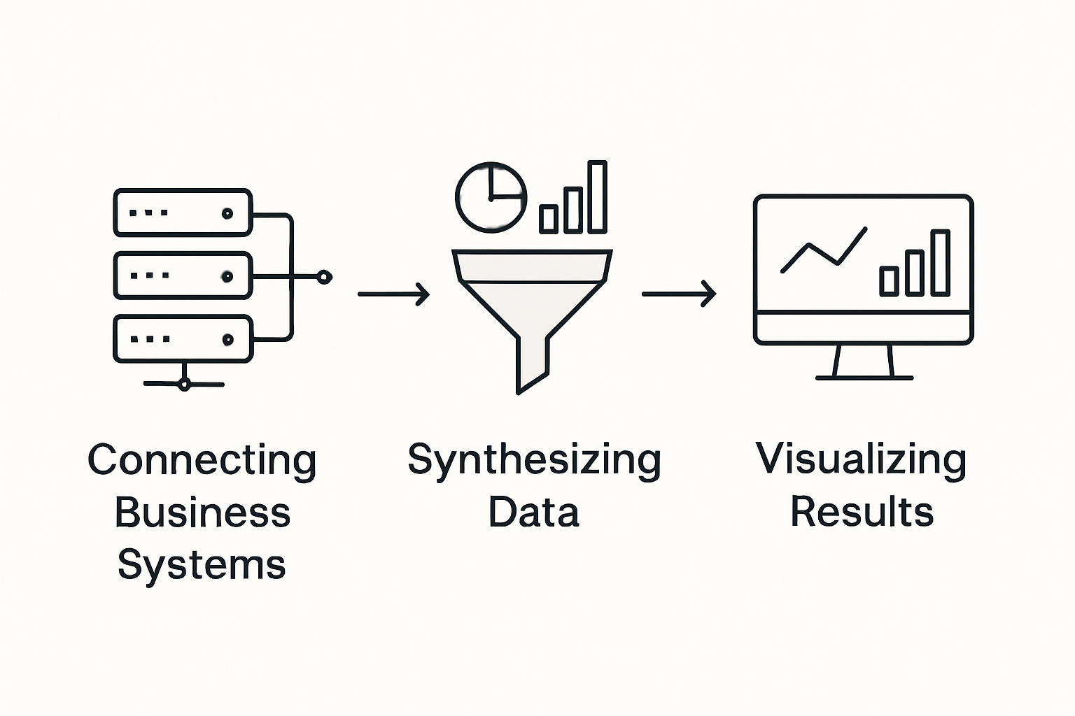
The healthcare sector provides compelling insights into the complex process of dashboard integration and collective data sensemaking. By developing iterative and adaptive approaches, organizations can create dashboard systems that dynamically process and interpret large volumes of complex information, breaking down traditional data silos and facilitating more nuanced organizational understanding.
Key strategies for effective dashboard integration include:
- API-Based Connectivity: Leveraging standardized communication protocols
- Real-time Data Synchronization: Ensuring immediate updates across platforms
- Universal Data Normalization: Transforming diverse data formats into consistent structures
- Secure Authentication Mechanisms: Implementing robust access control protocols
- Scalable Architecture: Designing systems that can handle increasing data complexity
Research in business education demonstrates that well-integrated dashboards serve more than just analytical purposes. They become powerful tools for innovation, enabling staff across organizational levels to make more informed, strategic decisions by providing contextualized and easily digestible information.
Ultimately, successful dashboard integration is about creating an intelligent ecosystem where data flows seamlessly, insights emerge naturally, and organizational decision-making becomes more agile and responsive. By embracing advanced integration techniques, companies can transform their raw data into a strategic asset that drives continuous improvement and competitive advantage.
Common Pitfalls and Best Practice Strategies
Dashboard design represents a complex challenge where even minor missteps can significantly compromise user experience and analytical effectiveness. Organizations must navigate a nuanced landscape of technical implementation and user-centric design to create truly impactful visualization platforms.
Research highlights the critical importance of responsive UI design and versatile user interface components. The most successful dashboards prioritize adaptability, allowing users to customize views, resize elements, and interact with data in intuitive ways. This approach prevents the common pitfall of creating rigid, one-size-fits-all visualization systems that quickly become obsolete or frustrating for users.
Common dashboard design pitfalls to avoid include:
-
Overcomplicated Interfaces: Cluttering dashboards with excessive information
-
Poor Color Contrast: Reducing readability and visual comprehension
-
Inconsistent Data Visualization: Mixing incompatible chart types
-
Lack of Contextual Information: Presenting raw data without meaningful explanation
-
Performance Bottlenecks: Creating slow-loading or resource-intensive dashboards
Studies in energy monitoring systems reveal that minimalist design with high-contrast visual themes dramatically improves user interaction and pattern recognition. Clear labeling, strategic use of color, and intuitive information hierarchy help users quickly identify critical insights and anomalies without cognitive overload.
Ultimately, successful dashboard design transcends technical implementation. It requires a deep understanding of user needs, organizational goals, and the delicate balance between information density and cognitive clarity. By embracing user-centric design principles and continuously iterating based on feedback, teams can create dynamic dashboards that truly empower decision-making.
Unlock the Power of Dynamic Dashboards with Custom Solutions
The article highlights how dynamic dashboard design solves the challenge of turning complex data into actionable insights through adaptability, customization, and real-time interactivity. If your team struggles with rigid, one-size-fits-all reporting tools that slow decision-making and create information overload, you are not alone. Dynamic dashboards require intelligent integration, user-centric design, and scalable architecture to truly empower operational teams and executives alike.
At Rule27 Design, we specialize in crafting bespoke administrative systems and internal tools that align perfectly with your unique business workflows. Our expertise in developing custom dashboard platforms means you can achieve faster data synchronization, real-time updates, and intuitive interfaces designed to enhance comprehension and strategic decision-making. Whether you need flexible operational dashboards or tailored analytical systems, we build scalable solutions that evolve as your business grows.
Explore how custom admin panels can transform your insight capabilities today.
Take control of your business intelligence and leave behind static reporting limitations. Visit Rule27 Design now to start building dynamic dashboards that truly work for your team and fuel smarter decisions.
Frequently Asked Questions
What is dynamic dashboard design?
Dynamic dashboard design is a business intelligence approach that enables organizations to create flexible, real-time visualization systems that adapt to changing operational needs, moving beyond static reporting.
What are the key benefits of using dynamic dashboards?
Dynamic dashboards offer adaptability, customization, scalability, and interactivity, allowing organizations to visualize data in a way that meets specific needs and improves decision-making processes.
How do modern dynamic dashboards integrate with existing business systems?
Modern dynamic dashboards utilize API-based connectivity, real-time data synchronization, and universal data normalization to seamlessly connect multiple data sources and enhance analytical capabilities.
What common pitfalls should be avoided in dashboard design?
Common pitfalls include overcomplicated interfaces, poor color contrast, inconsistent data visualization, lack of contextual information, and performance bottlenecks. Successful dashboards prioritize user experience and clarity.

About the Author
Josh AndersonCo-Founder & CEO at Rule27 Design
Operations leader and full-stack developer with 15 years of experience disrupting traditional business models. I don't just strategize, I build. From architecting operational transformations to coding the platforms that enable them, I deliver end-to-end solutions that drive real impact. My rare combination of technical expertise and strategic vision allows me to identify inefficiencies, design streamlined processes, and personally develop the technology that brings innovation to life.
View Profile

